
The measuring tape kept showing 4.5 inches. Then 6 inches. Then 3. I'd been standing on my IKEA stepladder for twenty minutes, holding up three Botticelli skateboard decks against my living room wall, trying to figure out why they looked wrong no matter how I positioned them. My girlfriend sat on the couch, scrolling her phone, occasionally glancing up to say "still not right" with zero helpful input on what would actually make it right.
That was two years ago, and I had no idea that creating a perfect triptych display was actually a science. Not rocket science, but there are real principles that separate "three random boards on a wall" from "holy crap, that looks professional."
After installing hundreds of triptych sets at DeckArts and talking to interior designers who actually know what they're doing, I've learned there's a formula. And once you understand it, hanging a set of three skateboard decks becomes straightforward instead of a frustrating guessing game that ends with your wall looking like Swiss cheese.
Why Triptychs Work: The Psychology Behind Three-Panel Art
Before we get into the technical stuff, let's talk about why sets of three work so damn well.
Triptychs have been around since medieval times - churches used them for altarpieces because three panels created a narrative flow that single paintings couldn't match. Your eye naturally moves from left to center to right, creating a visual journey. According to The New York Times' guide to hanging gallery walls, interior designer Kelly Wearstler explains that a well-arranged grouping of art "creates a real focal point and warmth in a room, and it says so much about you, as an extension of your style."
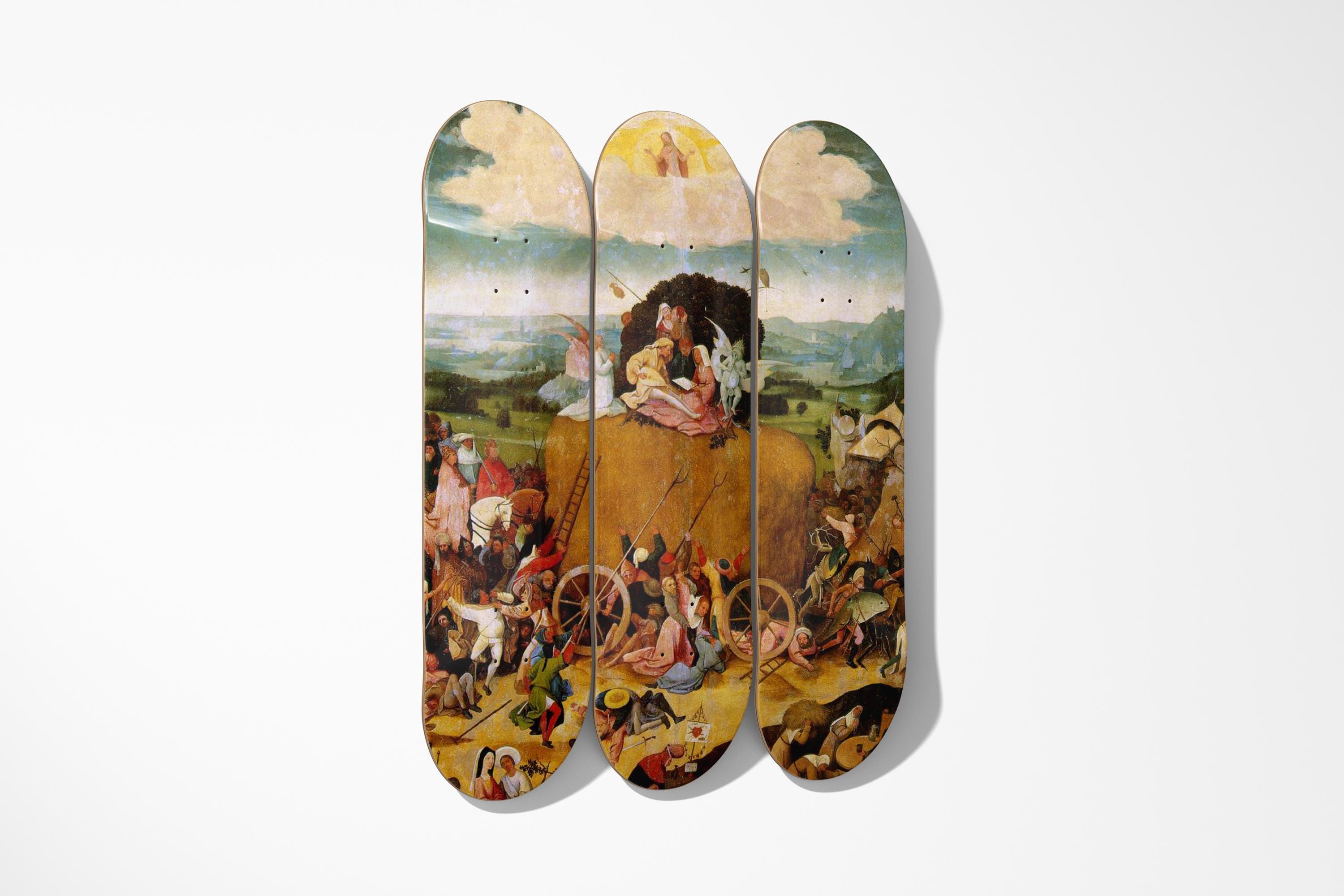
With skateboard decks specifically, the narrow vertical format of each board makes triptychs even more effective. Three decks side-by-side create a horizontal expanse that fills wall space without overwhelming it. Plus, skateboard art naturally lends itself to this format - many classical paintings were designed as triptychs (Hieronymus Bosch's "Garden of Earthly Delights," for example), so splitting them across three decks feels historically appropriate.
But here's the thing: triptychs only work if you follow some basic rules. Mess up the spacing or height, and instead of creating visual harmony, you've just created three separate pieces that happen to be near each other.
The Spacing Rule: 2-4 Inches Between Decks
This is where I screwed up initially. I was randomly trying different gaps - sometimes 3 inches, sometimes 6 - with no logic behind it.
The golden rule for skateboard triptychs? Keep 2-4 inches of space between each deck. That's it. Not 6 inches. Not 1 inch. Somewhere in that 2-4 inch range.
Why this specific measurement? Forbes' guide to arranging artwork explains that with clustered art arrangements, you should "try to maintain a fairly consistent distance between the frames. Otherwise it can look messy."
Here's the practical breakdown:
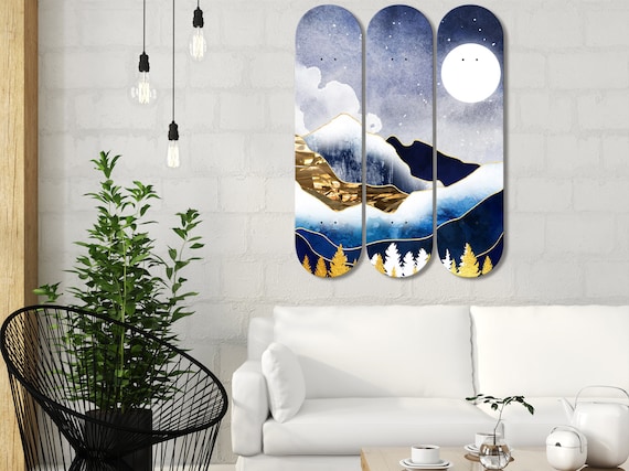
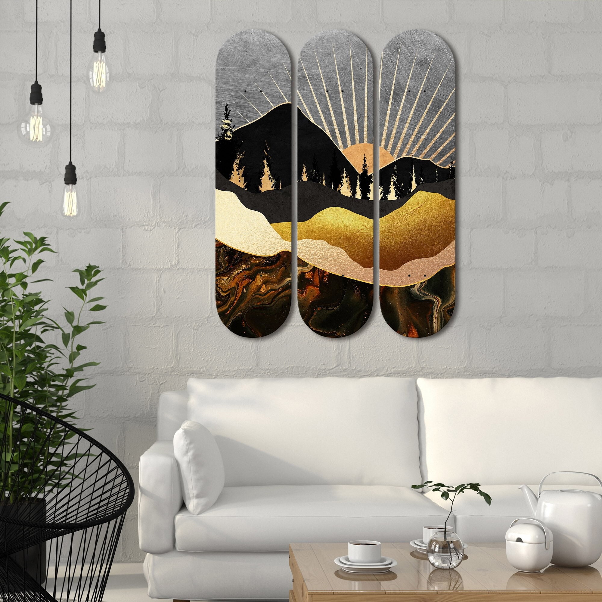
2 inches spacing - Use this when you want the triptych to read as one cohesive unit. This works especially well for pieces that form a continuous image across all three decks, like our Bouguereau "Amor and Psyche" set. The tighter spacing makes your eye blend the three panels into a single artwork.
3 inches spacing - The sweet spot for most installations. Gives each deck enough breathing room to be appreciated individually while still reading as a unified set. This is what I use 80% of the time.
4 inches spacing - Use this when each deck features a different but related image. The extra space emphasizes that these are three distinct pieces that work together thematically. Good for sets where each board shows a different character or scene from the same artistic period.
What about 5+ inches? Don't. Once you get past 4 inches, the visual connection breaks down and they start looking like three separate pieces that just happen to be on the same wall.
Height Placement: The 57-Inch Rule (With Skateboard Modifications)
Museums hang art with the center at 57-60 inches from the floor. This puts the focal point at average eye level for a standing adult.
For skateboard triptychs, you need to modify this slightly because of the vertical shape. Standard skateboard decks are typically 31-33 inches long. If you center them at 57 inches, the top of the deck ends up around 73-74 inches high, and the bottom around 41-42 inches.
That works perfectly above furniture (sofas, consoles, beds), but looks too low on a blank wall. Here's what I actually do:
Above furniture: Center the middle deck at 54-57 inches. This accounts for the furniture height and ensures the art doesn't float too high above it. According to design principles mentioned in The New York Times article, when hanging art above furniture, you want to leave "12 to 24 inches" of space between the furniture and where the artwork begins.
On a blank wall: Center at 60-62 inches. This compensates for the lack of furniture anchoring the piece and prevents it from looking too low.
In a hallway or narrow space: Go slightly lower, around 55-58 inches. Narrow spaces benefit from lower placement because you're often viewing the art from closer proximity.
Pro tip: Measure from the floor to the center point of the middle deck, not to where the hanging hardware goes. The hardware will be 2-6 inches above the center depending on your mounting system. This trips people up constantly.
Visual Flow: Creating a Cohesive Narrative
This is where art knowledge matters more than measuring tape.
A triptych isn't just three random pieces next to each other. There should be a visual logic to how they relate. Think of it like chapters in a book - each panel should connect to the next in some meaningful way.
Continuous Image Triptychs
The most obvious approach: one image split across three decks. Bosch's "Garden of Earthly Delights" is the classic example - left panel shows paradise, center shows earthly pleasures, right panel shows hell. When you split a large painting across three skateboard decks, each panel reveals a different portion of the composition.
The challenge? You need high-resolution source images so the details don't get lost. At DeckArts, we work directly with museums to get scans good enough that even small details remain sharp when split across multiple decks.
Thematic Triptychs
Each deck features a different but related image. Maybe three different portraits from the same Renaissance artist. Or three landscapes that share similar color palettes and composition styles. The pieces don't form one continuous image, but they clearly belong together.
This approach gives you more flexibility in spacing (that 3-4 inch range works better here) and allows each piece to be appreciated individually.
Progressive Triptychs
Less common but striking when done right - the composition progresses from left to right. Maybe the left panel is darker and becomes lighter as you move right. Or abstract shapes that become more defined. This creates a sense of movement and transformation.
The Installation Process: Step-by-Step
Okay, you've got your three decks, you understand spacing and height. Now let's actually get them on the wall without destroying it.
Step 1: Use Paper Templates
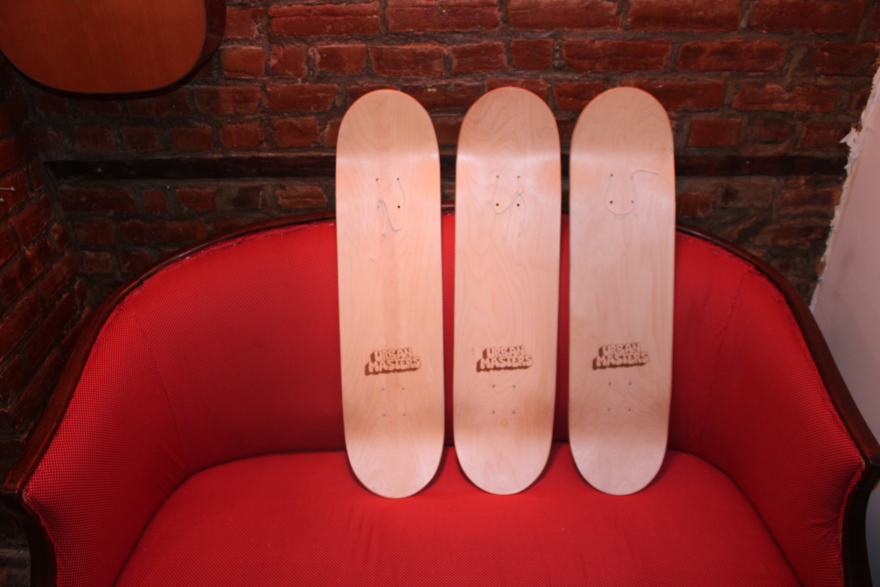
Cut out three pieces of kraft paper the exact size of your skateboard decks (usually 8 x 31 inches). Tape them to the wall in your desired arrangement. This lets you see the layout before making any holes.
Move the paper around. Live with it for a day. Take photos from different angles. You'll often notice issues you missed initially - too high, too clustered, not centered on the wall.
Step 2: Mark Your Levels
Once you're happy with the paper template placement, use a level to draw a light pencil line across all three centers. This ensures all three decks hang at the exact same height. Even being off by half an inch will make the triptych look sloppy.
Measure the distance from the top of each deck to its hanging hardware. Mark these measurements on your wall. This is where your hooks will go.
Step 3: Install Appropriate Hardware
Standard picture hooks won't cut it for skateboard decks. Each deck weighs 2-4 pounds, and you need something more robust.
I recommend:
- For drywall: Heavy-duty picture hangers rated for 30+ pounds each
- For studs: Wood screws directly into the stud (ideal when possible)
- For plaster/brick: Toggle bolts or masonry anchors
Want to avoid damage completely? French cleats work great for skateboard decks and distribute weight evenly. We cover this in detail in our guide to hanging skateboard art without wall damage.
Step 4: Hang the Center Deck First
Always start with the middle piece. This becomes your anchor point.
Hang it, make sure it's level, step back and verify it looks right. If the center deck is off, everything else will be off.
Step 5: Add Left and Right Panels
Hang the left and right decks, using your spacing measurements (2-4 inches from the center deck). Double-check with a level that all three hang at the same height.
Step back frequently during installation. What looks level up close might look crooked from viewing distance.
Common Mistakes (And How to Avoid Them)
Mistake #1: Inconsistent Spacing
The gap between deck 1 and 2 is 3 inches, but between deck 2 and 3 it's 4.5 inches. This asymmetry kills the whole composition.
Solution: Measure twice, hang once. Use your paper templates and a tape measure. Mark spacing clearly before installing hardware.
Mistake #2: Uneven Heights
One deck hangs slightly higher than the others. Even a quarter-inch difference is noticeable.
Solution: Use a level. Draw a guideline. Don't eyeball it. Your eye is not as accurate as you think it is.
Mistake #3: Choosing Unrelated Pieces
Three skateboard decks with completely different art styles - one Renaissance, one modern abstract, one street art. They don't form a cohesive triptych, they just look confused.
Solution: Choose pieces that share visual DNA. Same art period, complementary colors, similar composition styles, or a clear thematic connection. This is where understanding authenticity and artistic integrity really matters.
Mistake #4: Ignoring Furniture Scale
Hanging a triptych above a 96-inch sofa but the three decks only span 30 inches total. The scale is completely wrong.
Solution: The triptych should be roughly 2/3 to 3/4 the width of the furniture below it. For a standard sofa (80-90 inches wide), your triptych should span about 54-68 inches. With 8-inch-wide decks and 3-inch spacing, you're looking at 30 inches - too narrow. You'd need to increase spacing to 12-14 inches between decks, or add more pieces.
Mistake #5: Poor Lighting
Beautiful triptych, but it's in a dark corner where nobody can see the details.
Solution: Lighting is half the battle. We have an entire guide dedicated to skateboard art lighting because it's that important. Picture lights, track lighting, or even smart bulbs in nearby fixtures - figure out your lighting before you hang the art.
Room-Specific Triptych Strategies
Living Rooms: Above the Sofa
The most common placement. The sofa provides a strong horizontal anchor, and the triptych creates a focal point.
Best practices:
- Leave 6-8 inches between the sofa back and the bottom of the lowest deck
- Center the triptych on the sofa, not the wall (unless they're the same)
- Use 2-3 inch spacing to create a unified composition
- Ensure the total width is 2/3 to 3/4 of the sofa width
Bedrooms: Above the Headboard
Similar to living rooms but with different sight lines. You're viewing this art from bed (lying down) and while standing in the room.
Best practices:
- Hang slightly higher than above a sofa - center around 55-58 inches
- Choose calmer, less busy compositions for bedrooms
- Our "Girl with a Pearl Earring" duo set works beautifully here (technically a diptych, but the same principles apply)
Hallways: Narrow Spaces
Hallways present unique challenges - you're viewing the art from closer proximity and often from an angle as you walk past.
Best practices:
- Hang lower than normal (55-57 inch center) because you're closer
- Use tighter spacing (2-2.5 inches) to keep the visual footprint compact
- Choose pieces with strong, bold imagery that reads well from close up
Dining Rooms: Setting the Mood
Dining rooms benefit from more elaborate compositions. People sit here for extended periods, giving them time to really look at the art.
Best practices:
- Hang at seated eye level (48-52 inches from floor to center)
- Choose pieces with narrative elements or interesting details to discover
- Consider how the lighting from your dining fixture affects the art
Advanced Triptych Techniques
Asymmetrical Spacing
Most triptychs use even spacing, but intentional asymmetry can create visual interest. For example, 2 inches between decks 1 and 2, but 5 inches between decks 2 and 3. This creates a pause in the visual flow, emphasizing that the right panel is somehow different or separate.
This is advanced territory. Get comfortable with standard installations first.
Staggered Heights
Instead of all three decks at the same height, the middle one hangs slightly lower (2-3 inches). This creates a gentle arc and adds dynamism to the composition.
The New York Times guide suggests that when hanging multiple pieces, you can either align them all at the same height or "anchor just one piece at eye-level and hang other pieces in relation to it" to create visual interest.
Warning: This only works with certain artistic styles. Renaissance portraits at staggered heights look wrong. Abstract or modern pieces can pull it off.
Mixed Deck Sizes
Using three different deck sizes - say, one 8-inch, one 8.5-inch, one 7.5-inch width. The size variation creates rhythm and prevents the composition from feeling too rigid.
Again, advanced technique. Stick with matching sizes initially.
Choosing the Right Pieces for Your Triptych
Not every three decks make a good triptych. Here's what to look for:
Visual Continuity
Do the three pieces share enough visual characteristics to read as a set? Common elements include:
- Color palette (similar tones and hues)
- Artistic period (all Renaissance, all Baroque, etc.)
- Subject matter (all portraits, all landscapes, all religious scenes)
- Composition style (similar use of space, perspective, lighting)
Complementary Content
The three pieces should complement each other without being redundant. Three nearly identical portraits? Boring. Three portraits that show different moods or perspectives? Interesting.
Professional Quality
A triptych amplifies everything - including quality issues. If one deck has mediocre printing or cheap materials, it'll drag down the entire composition. All three pieces need to be the same quality level.
At DeckArts, every deck uses the same materials (7-ply Canadian maple, museum-grade printing, UV-resistant coating) so triptych sets maintain consistency. When you mix pieces from different manufacturers or quality tiers, visual inconsistencies become obvious.
The Role of Framing and Mounting
Should you frame skateboard decks or mount them directly?
For triptychs, I strongly prefer direct mounting without frames. Frames add bulk and visual weight, and with three pieces side-by-side, that bulk multiplies. The result often feels cluttered.
Direct mounting keeps the focus on the artwork itself and emphasizes the skateboard deck as an art object. The natural maple edges become part of the aesthetic.
Exception: If you're going for a more traditional gallery wall look and mixing skateboard art with framed prints or photos, then consistent framing across all pieces makes sense.
Maintenance and Adjustments
Triptychs aren't "hang and forget." Over time:
Decks may shift - Temperature and humidity changes cause wood to expand and contract. Check your triptych every 6 months and adjust if pieces have drifted out of alignment.
Hardware loosens - Especially on drywall. If you notice a deck sitting slightly crooked, tighten the mounting hardware.
Lighting changes - Rearrange furniture, change bulbs, or add new lamps and suddenly your carefully lit triptych is in shadow. Reassess lighting annually.
Your taste evolves - Maybe that triptych that seemed perfect two years ago no longer reflects your aesthetic. Don't be afraid to remix pieces or try new arrangements. Art should grow with you.
The Bottom Line: Trust the Process
Creating a perfect triptych display isn't about having perfect taste or an innate design sense. It's about following principles that have been proven over centuries of art history.
Consistent spacing (2-4 inches). Proper height (54-62 inches to center). Visual coherence (pieces that actually relate to each other). Solid installation (proper hardware and level hanging). Good lighting (so people can actually see your carefully curated display).
Get those fundamentals right, and your skateboard triptych will look like it was installed by a professional designer. Ignore them, and you'll end up like me two years ago - standing on a wobbly stepladder, eyeballing measurements, wondering why three beautiful pieces somehow look wrong together.
The measuring tape doesn't lie. The level doesn't lie. The principles of visual composition don't lie. Trust the process.
And if your girlfriend says "still not right" after you've followed all these guidelines? Maybe get a second opinion.
About the Author
Stanislav Arnautov is the founder of DeckArts, bringing Renaissance masterpieces to modern homes through skateboard wall art. Originally from Ukraine and now based in Berlin, Stanislav combines his passion for classical art with sustainable craftsmanship. With over four years of experience in the European art market, he's helped hundreds of collectors discover unique pieces that bridge street culture and museum-quality art.


0 comments