

You know what drives me crazy? Seeing incredible skateboard art collections documented with terrible photography. Last week, a collector from Berlin sent me photos of his setup that included our Caravaggio Medusa Skateboard Wall Art, and I could barely make out the details because of harsh shadows and weird color casts from bad lighting.
But here's the thing - and I learned this from my years organizing art events for Red Bull Ukraine - good photography isn't just about having expensive equipment. It's about understanding light, composition, and how to make art look as impressive in photos as it does in person. And honestly? Some of the best skateboard collection photos I've seen were shot with smartphones using the right techniques.
Actually, proper photography has become essential for skateboard art collectors in 2025. Whether you're documenting pieces for insurance, sharing your collection on social media, or considering selling pieces later, quality photography directly impacts how people perceive and value your collection.
Understanding Light: The Foundation of Great Art Photography
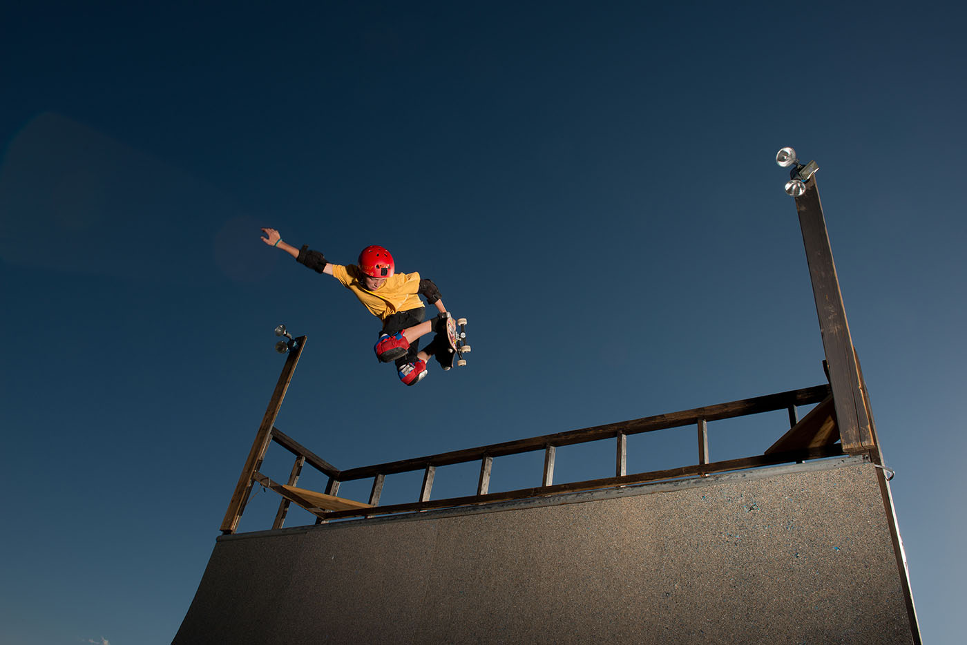
Here's something most people don't realize about photographing skateboard art - the lighting challenges are completely different from regular skateboard photography. Instead of freezing motion and creating drama, you're trying to accurately represent color, texture, and artistic detail. That requires a completely different approach.
Natural light is your friend, but timing matters. The best light for photographing skateboard wall art happens during overcast days or in large windows with indirect sunlight. Direct sunlight creates harsh shadows and can wash out colors, especially on glossy skateboard surfaces.
Color temperature consistency is crucial. Mixed lighting sources (fluorescent + LED + natural light) create color casts that make artwork look completely different than it appears in person. Pick one light source and stick with it throughout your photo session.
From my graphic design background, I understand how critical accurate color reproduction is. When documenting classical art reproductions like our pieces, you want colors that match what viewers will see when they visit your collection in person.
I covered some related lighting considerations in my Smart Skateboard Display Systems: Tech-Enhanced Wall Art for 2025 article, where display lighting also affects photography opportunities.

Camera Settings That Actually Work for Art Documentation
Forget everything you know about skateboard action photography - art documentation requires completely different technical approaches. After thousands of photos documenting DeckArts pieces, here's what actually works:
Aperture priority mode at f/8-f/11. This provides enough depth of field to keep the entire skateboard sharp while maintaining good image quality. Most lenses perform best in this range, and you'll avoid the softness that happens at wider apertures.
ISO as low as possible. Art photography requires maximum detail and minimal noise. Use a tripod and shoot at ISO 100-200 whenever possible. The extra detail is worth the setup time.
Shoot in RAW format always. This gives you maximum flexibility for color correction and ensures you capture all the detail in the artwork. JPEG compression can eliminate subtle color gradations that are crucial in classical art reproduction.
White balance manually set. Don't trust auto white balance with mixed lighting. Set it manually based on your primary light source, or shoot a gray card for reference.
The technical setup might seem tedious, but it makes the difference between documentation photos and professional-quality images that do justice to your collection.
Composition Techniques for Maximum Impact
This is where my experience in graphic design and art curation really helps. Good composition can make a modest collection look significant, while poor composition can make even impressive pieces look amateur.
The rule of thirds still applies, but carefully. For single skateboard shots, placing the deck slightly off-center often creates more dynamic compositions than centering it. But be careful not to cut off important visual elements of the artwork.
Context matters for collection shots. Wide shots that show how pieces relate to each other and to the space create more compelling narratives than isolated close-ups. Show the environment - furniture, lighting, room character - that gives context to your collecting choices.
Vertical vs. horizontal orientation. Most skateboard art looks best photographed vertically (matching how they're displayed), but horizontal shots can work well for showing multiple pieces or emphasizing the integration with room design.
For our Botticelli's Birth of Venus Skateboard Wall Art, the composition benefits from showing enough surrounding space to let the classical elements breathe, while cropping tight enough to capture the intricate details that make the piece special.
Equipment Recommendations by Budget Level
You don't need professional studio equipment to get excellent results, but certain tools make the process much easier and more consistent.
Smartphone setup ($0-100): A quality smartphone with manual controls can produce surprisingly good results. Add a small tripod ($20-30) and a reflector disc ($15-25) for basic light control. Apps like Adobe Lightroom Mobile give you manual control over exposure and white balance.
Enthusiast setup ($200-500): DSLR or mirrorless camera with a standard zoom lens, decent tripod, and basic lighting kit. This provides much better control over depth of field and image quality than smartphone setups.
Semi-professional setup ($500-1500): Full-frame camera, quality tripod, professional lighting stands, and softboxes for consistent lighting. This level gives you complete control over every aspect of the image and produces results suitable for insurance documentation or potential sale purposes.
The key is matching your investment level to your needs. If you're documenting a valuable collection for insurance purposes, the semi-professional setup pays for itself in accurate documentation.
Lighting Setups That Work in Real Homes
Most photography tutorials assume you have a dedicated studio space, but real skateboard collections live in apartments, houses, and spaces with existing constraints. Here's how to work with what you have:
Single window setup: Position your skateboard perpendicular to a large window on an overcast day. Use a white poster board or reflector on the opposite side to fill in shadows. This creates soft, even lighting that's perfect for art documentation.
Two-light setup: If you're investing in artificial lighting, use two identical LED panels or softboxes positioned at 45-degree angles to the artwork. This eliminates shadows while providing even coverage across the entire surface.
Existing room lighting: Work with what you have, but be consistent. If your collection is displayed under specific lighting conditions, photograph it under those same conditions. This gives viewers an accurate sense of how the pieces look in their intended environment.
The goal is predictable, repeatable results. Once you find a lighting setup that works in your space, document it so you can recreate the same conditions for future photography sessions.
Dealing with Reflective Surfaces and Glare
Skateboard decks have clear protective coatings that can create problematic reflections, especially under artificial lighting. This is one of the biggest technical challenges in skateboard art photography.
Polarizing filters can eliminate many reflections, but they also reduce overall light and can affect color saturation. Use them selectively and test the results.
Angle adjustment often works better than filters. Shooting at slight angles to the skateboard surface (rather than perfectly perpendicular) can eliminate most reflections while maintaining good detail reproduction.
Diffused lighting creates fewer problematic reflections than direct lighting. Softboxes, umbrellas, or even white sheets can diffuse harsh light sources and reduce glare.
For pieces with heavy clear coat protection, sometimes accepting minimal reflections creates more natural-looking images than trying to eliminate them completely.
Post-Processing for Art Accuracy
This is where many photographers go wrong with art documentation. The goal isn't to make dramatic, stylized images - it's to accurately represent the artwork as viewers would see it in person.
Color correction is critical. Use white balance adjustment to ensure colors match the actual artwork. If you shot a gray card reference, use it to set proper white balance in post-processing.
Contrast adjustment should be subtle. Avoid high-contrast looks that might be dramatic but don't accurately represent the artwork. Classical art reproduction relies on subtle color and tonal relationships.
Sharpening should be minimal. Over-sharpening creates unrealistic-looking images and can introduce artifacts that distract from the artwork itself.
Straightening and perspective correction are essential. Even small cropping or keystone corrections make images look more professional and accurate.
I covered some of these technical considerations in my Skateboard Art Maintenance: Preserving Your Investment Over Time article, where documentation photography becomes part of long-term collection management.
Creating Compelling Social Media Content
While documentation photography focuses on accuracy, social media photography allows more creative freedom. The challenge is balancing artistic impact with authentic representation of your collection.
Story-driven compositions work better than isolated product shots. Show your skateboard art in context - how it relates to your space, your lifestyle, your aesthetic choices. People connect with narratives, not just objects.
Lifestyle integration demonstrates how skateboard art functions as part of a broader design vision. Show pieces during different times of day, from different viewing angles, as part of room arrangements that change seasonally.
Detail shots highlight aspects that might be missed in wide collection photos. Close-ups of texture, color interaction, or artistic techniques can create compelling content while educating viewers about what makes quality skateboard art special.
Behind-the-scenes content showing collection arrangement, new acquisitions, or maintenance processes creates ongoing engagement rather than static display photos.
Insurance and Documentation Photography Standards
If your skateboard art collection has significant value, proper documentation photography isn't just about aesthetics - it's about financial protection. Insurance companies and appraisers have specific requirements for documentation photos.
Overall shots showing the entire piece in context, with clear view of any mounting hardware, frame systems, or display methods.
Detail shots documenting any damage, wear, signatures, or unique characteristics that affect value or authenticity.
Scale references using standard objects (coins, rulers) to establish size relationships in photos.
Lighting consistency across all documentation ensures accurate color representation for identification purposes.
Date and location metadata preserved in image files provides timeline documentation for insurance and legal purposes.
Professional documentation pays for itself if you ever need to file insurance claims or provide proof of ownership and condition.
Photographing Different Art Styles
Not all skateboard art photographs the same way. Different artistic styles and printing methods require adjusted approaches for optimal results.
Classical reproductions (like our DeckArts pieces) benefit from even, museum-quality lighting that emphasizes color accuracy and fine detail reproduction. Dramatic lighting can overwhelm subtle color relationships in Renaissance artwork.
Contemporary graphic designs with bold colors and high contrast can handle more dramatic lighting setups. Side lighting can emphasize texture and create visual interest without sacrificing important details.
Hand-painted pieces require careful attention to surface texture and brushwork details. Slightly angled lighting can reveal artistic technique while maintaining good overall visibility.
Limited edition prints need documentation that shows both the overall composition and any unique identifying marks, signatures, or numbering.
Our Bosch Garden of Earthly Delights Skateboard Deck Triptych presents particular challenges because of its complex, detailed composition that rewards both wide shots showing the overall narrative and close-ups revealing the intricate symbolic elements.
Building a Photography Workflow
Consistency matters more than perfection in collection photography. Developing a repeatable workflow ensures all your pieces are documented to the same standards over time.
Pre-shoot preparation: Clean skateboard surfaces, check for proper mounting, prepare lighting setup, charge batteries, clear memory cards.
Shooting sequence: Start with overall room shots, then individual pieces, then detail shots. This ensures you capture context before focusing on specifics.
File organization: Develop a consistent naming and folder structure that makes finding specific images easy months or years later.
Backup strategy: Important documentation should be backed up to multiple locations. Cloud storage provides off-site protection for irreplaceable documentation.
Regular updates: Re-photograph pieces periodically to document any changes in condition, new acquisitions, or collection rearrangements.
The goal is making photography feel like a natural extension of collection management rather than a separate, overwhelming project.
Common Mistakes to Avoid
After seeing hundreds of skateboard collection photos, certain mistakes appear repeatedly. Avoiding these common issues immediately improves your results:
Mixed lighting sources creating color casts that make artwork look unnatural or inconsistent.
Shooting too close and losing context, or too far and losing important details.
Ignoring backgrounds that distract from the artwork or create conflicting visual elements.
Over-processing that makes images look artificial rather than accurately representing the collection.
Inconsistent documentation where some pieces are beautifully photographed while others get minimal attention.
Forgetting updates when collections change, pieces are rearranged, or conditions change over time.
I explored some of these presentation considerations in my The Science of Skateboard Art Mounting: Wall Safety and Aesthetics article, where proper mounting creates better photography opportunities.
About the Author
Stanislav Arnautov is the founder of DeckArts and a creative director originally from Ukraine, now based in Berlin. With extensive experience in branding, merchandise design, and vector graphics, Stanislav has worked with Ukrainian streetwear brands and organized art events for Red Bull Ukraine. His unique expertise combines classical art knowledge with modern design sensibilities, creating museum-quality skateboard art that bridges Renaissance masterpieces with contemporary culture. Follow him on Instagram, visit his personal website stasarnautov.com, or check out DeckArts on Instagram and explore the curated collection at DeckArts.com.


0 comments