

Walking through IKEA Tempelhof last spring, surrounded by blonde wood and neutral textiles, I had an epiphany that would reshape my entire approach to interior design. The clean lines and functional beauty of Scandinavian aesthetics didn't oppose skateboard culture—they enhanced it. Both movements celebrate authentic materials, functional design, and honest craftsmanship. The challenge wasn't reconciling opposing philosophies, but discovering how they naturally complement each other.
My 65-square-meter apartment in Prenzlauer Berg became the testing ground for this theory. Built in 1905 with typical Berlin altbau features—high ceilings, herringbone floors, tall windows—it provided the perfect canvas for experimenting with how skateboard art could enhance rather than disrupt Scandinavian design principles. Two years of careful curation later, I've discovered that some of the most sophisticated interior spaces emerge from unexpected cultural combinations.
The key insight came during a visit to Stockholm's Moderna Museet, where I noticed how contemporary Scandinavian artists incorporated urban influences while maintaining their aesthetic DNA. The same principle could apply to residential design: skateboard art doesn't need to dominate or define a space, but can contribute to overall sophistication when selected and displayed with proper sensitivity to existing design languages.
The Foundation: Understanding Scandinavian Principles

Scandinavian design succeeds through restraint, functionality, and celebration of natural materials. Light colors maximize brightness in northern climates, while clean lines prevent visual clutter in compact living spaces. Quality furniture serves multiple generations, and every object earns its place through both beauty and utility.
These principles initially seemed incompatible with skateboard art's bold graphics and street culture origins. However, deeper analysis revealed surprising alignments. Skateboard construction celebrates functional materials—seven-ply maple, screen-printed graphics, industrial hardware—that honor craftsmanship and durability. The narrow profiles maximize visual impact while minimizing spatial intrusion. The cultural authenticity parallels Scandinavian design's honest material expression.
The breakthrough came from approaching skateboard art as functional objects transitioning to decorative purposes, similar to how Scandinavian design incorporates traditional tools, textiles, or furniture pieces as display elements. A skateboard deck represents authentic craftsmanship and cultural significance, just like a vintage Swedish weaving or Norwegian woodworking tool.
This reframe allowed me to select and display skateboard pieces using Scandinavian curation principles: quality over quantity, authentic materials over synthetic finishes, and cultural significance over trendy aesthetics. The results felt naturally integrated rather than forced or apologetic.
Color Palette Integration: The 70/20/10 Rule
Successful integration required developing a systematic approach to color coordination that honored both design traditions without compromising either. I adapted the classic 70/20/10 interior design rule to accommodate skateboard graphics within Scandinavian color schemes.
The 70% base consists of classic Scandinavian neutrals: soft whites, warm grays, natural wood tones, and cream accents. These colors dominate walls, large furniture pieces, and textiles, creating the calm foundation essential to Nordic aesthetics.
The 20% secondary colors introduce subtle warmth and personality: muted blues, sage greens, dusty pinks, or soft yellows. These appear in throw pillows, artwork, ceramics, and smaller furniture pieces, adding visual interest without overwhelming the space.

The 10% accent colors provide energy and focal points—here's where skateboard graphics find their role. Bold reds, electric blues, vibrant oranges, or deep purples from skateboard art create controlled visual excitement within the restrained overall palette. These colors appear sparingly but strategically, preventing overwhelming while adding cultural authenticity and personal expression.
This systematic approach allows skateboard pieces to contribute to rather than compete with Scandinavian aesthetics. A single board with strong red elements can anchor an entire room's color scheme, while multiple boards in complementary colors create sophisticated progression throughout connected spaces.
The key lies in treating skateboard colors as intentional design choices rather than accepting whatever graphics appeal culturally. This requires building collections strategically rather than impulsively, prioritizing pieces that serve both aesthetic and cultural functions.
Material Harmony: Wood, Metal, and Authenticity
Scandinavian design celebrates honest materials that age beautifully and perform reliably over time. Skateboard decks, constructed from premium seven-ply maple with screen-printed graphics and industrial hardware, align perfectly with these material preferences when understood properly.
The natural wood grain visible around skateboard graphics echoes the blonde woods central to Scandinavian furniture traditions. Both materials improve with age, developing character and patina that adds warmth and authenticity to living spaces. The construction quality of authentic skateboard decks rivals fine furniture in durability and craftsmanship.
Metal mounting hardware can complement rather than clash with Scandinavian aesthetics when chosen thoughtfully. Brushed steel or matte black finishes integrate seamlessly with modern Nordic lighting fixtures, furniture hardware, and architectural details. Avoid bright chrome or decorative finishes that feel inconsistent with Scandinavian restraint.
The screen-printing process used for quality skateboard graphics shares philosophical DNA with Scandinavian textile traditions—both celebrate functional decoration that serves aesthetic and practical purposes simultaneously. The graphics aren't merely applied decoration but integral elements of the object's identity and function.
This material authenticity allows skateboard art to feel natural within Scandinavian contexts rather than foreign or imposing. When visitors understand the craftsmanship and cultural significance behind the pieces, they appreciate them as legitimate design objects rather than casual decorations.
Spatial Planning: The Art of Restraint
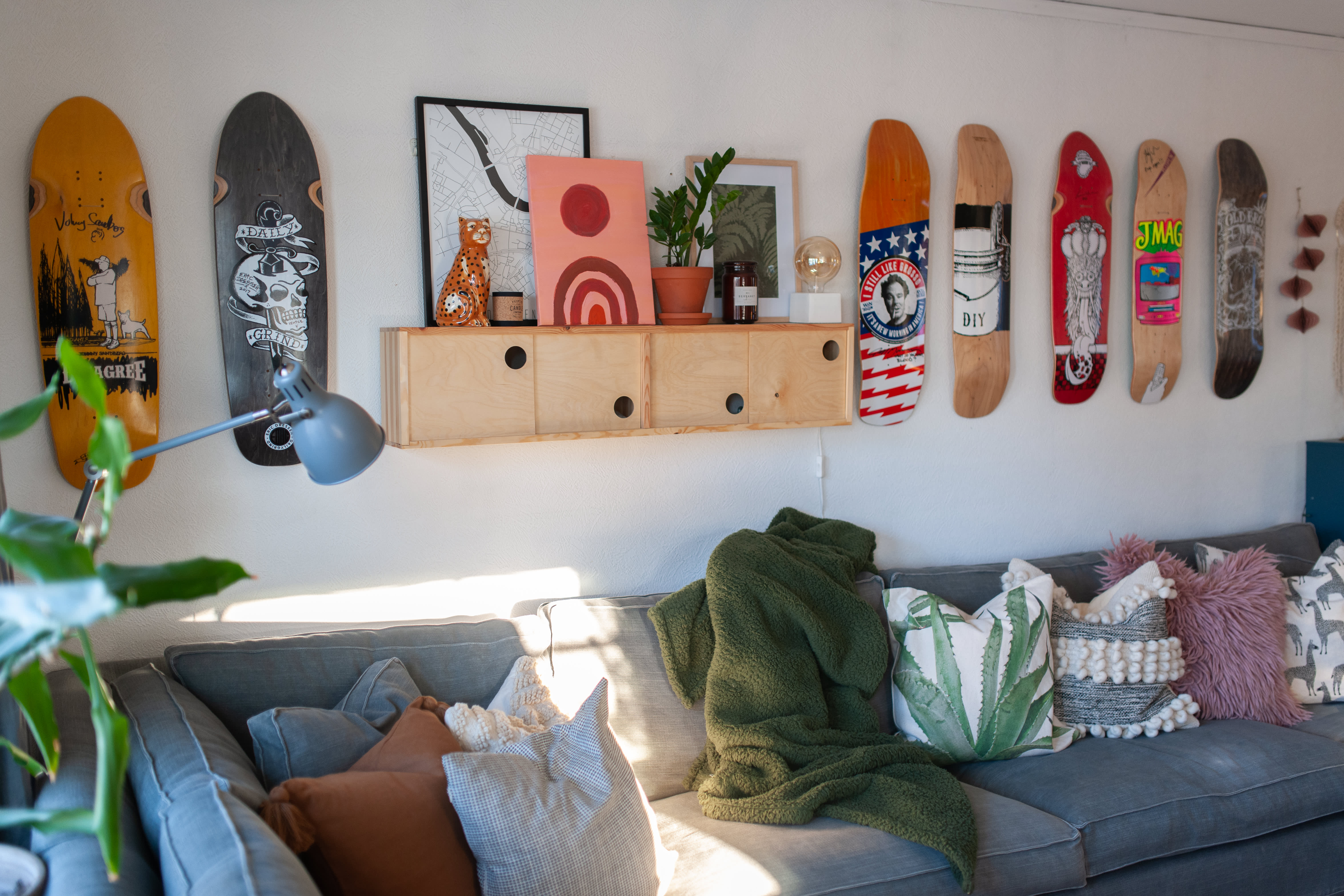
Scandinavian interiors succeed through generous negative space that allows individual elements to breathe and shine. This principle proves crucial when incorporating skateboard art, which can easily overwhelm spaces if not positioned with proper restraint and consideration for surrounding elements.
In my living room, a single carefully selected piece from our collection anchors the main wall above a simple oak credenza. The board's muted blue and gray graphics complement the room's textile colors while the natural wood edges echo the furniture's material palette. Positioning it alone rather than in groupings maintains Scandinavian preference for uncluttered compositions.
The bedroom features two boards arranged with generous spacing—approximately 18 inches apart—creating a subtle diptych that provides visual interest without competing with the room's restful energy. The key lies in treating each board as a significant design element worthy of space and consideration rather than crowding multiple pieces together.
Storage solutions follow Scandinavian functionality principles while accommodating rotating skateboard displays. Simple floating shelves hold boards not currently displayed, maintaining easy access for seasonal arrangement changes while preventing visual clutter from unused pieces.
The dining area remains intentionally minimal, allowing architectural features and natural light to dominate. This restraint makes the living room skateboard art feel more significant and intentional rather than part of an overwhelming collection displayed everywhere simultaneously.
Lighting: Enhancing Nordic Brightness
Scandinavian design maximizes limited natural light through reflective surfaces, light colors, and strategic artificial illumination. Proper lighting becomes essential for skateboard art integration, both for aesthetic appreciation and cultural respect for the graphics' artistic significance.
Natural light from the apartment's south-facing windows provides beautiful illumination during morning and early afternoon hours. The skateboard graphics' colors appear most vibrant in natural light, while the dimensional depth of the boards creates subtle shadows that add visual interest without overwhelming surrounding elements.
Evening lighting requires more deliberate planning. Warm LED strip lighting (2700K color temperature) installed behind the living room credenza creates ambient uplighting that enhances both the skateboard art and surrounding Scandinavian furniture. This indirect approach maintains Nordic preference for soft, diffused illumination while ensuring proper visibility of graphic details.
As I learned through expensive experimentation detailed in my lighting guide, direct spotlighting can create harsh shadows and glare that conflicts with Scandinavian lighting principles. Gentle, even illumination works better for both aesthetic integration and daily living comfort.
Candles provide atmospheric lighting that honors Scandinavian hygge traditions while creating warm, intimate environments where skateboard art feels natural rather than intrusive. The key lies in balancing enough light for graphic appreciation with soft ambiance that supports relaxation and social connection.
Furniture Selection: Complementary Rather Than Competing
Successful integration requires furniture choices that enhance rather than compete with skateboard art for visual attention. Scandinavian design's clean lines and neutral colors provide perfect backdrops for skateboard graphics' visual energy and cultural significance.
The living room's main seating consists of a simple gray linen sofa with oak legs that echo the skateboard decks' natural wood elements. The neutral upholstery allows skateboard colors to provide the room's primary visual excitement while maintaining overall sophistication and adult appeal.
Storage furniture serves dual purposes—displaying objects while hiding clutter that would compromise Scandinavian cleanliness. A tall oak bookshelf provides background for one skateboard piece while housing books, ceramics, and plants that support the overall aesthetic without competing for attention.
The dining table, a simple oak rectangle with clean lines, anchors conversations while maintaining sight lines to living room skateboard displays. This visual connection creates flow between spaces while respecting each area's functional requirements and aesthetic character.
Textile choices—wool throws, linen pillows, cotton curtains—provide softness and warmth that balance skateboard art's hard edges and bold graphics. These materials also contribute to acoustic comfort in the high-ceilinged space while maintaining authenticity to both design traditions.
The Test: Hosting Friends and Family
The ultimate validation came through hosting friends and family who represented different cultural backgrounds and aesthetic preferences. Would they appreciate the integration, or would the combination feel forced or unsuccessful?
Reactions exceeded expectations. Scandinavian design enthusiasts appreciated how skateboard art added personality and cultural authenticity without compromising the overall aesthetic restraint they valued. Skateboard culture friends respected the sophisticated presentation that honored their cultural artifacts while making them accessible to broader audiences.
Most importantly, both groups found the space comfortable and welcoming. The integration felt natural rather than self-conscious, supporting conversations and social connection rather than demanding attention or explanation. This comfort level indicated successful balance between different cultural influences.
Comments focused on specific pieces rather than the overall concept, suggesting visitors engaged with individual skateboard graphics as legitimate art rather than questioning their presence in a Scandinavian-influenced space. This acceptance validated the integration approach and encouraged further experimentation.
Seasonal Adaptations: Keeping it Fresh
Scandinavian design embraces seasonal changes through textiles, lighting, and natural elements that reflect Nordic climate patterns. Skateboard art can participate in these seasonal rhythms through strategic rotation and complementary decorative adjustments.
Winter arrangements emphasize warmth and coziness through richer textile colors and additional candle lighting. Skateboard pieces with warmer color palettes—reds, oranges, deep blues—feel more appropriate during darker months while maintaining cultural authenticity and aesthetic impact.
Spring cleaning includes rotating skateboard displays to prevent visual fatigue while ensuring pieces receive proper care and maintenance. Proper preservation techniques become essential for maintaining both aesthetic appeal and financial value as collections grow and evolve.
Summer's increased natural light allows for pieces with more subtle graphics or cooler color palettes that might disappear during darker months. This seasonal sensitivity keeps the integration feeling fresh and responsive to changing environmental conditions.
The rotation process also provides opportunities to appreciate pieces individually rather than becoming desensitized to their visual impact through constant exposure. This prevents the common problem of artwork becoming invisible through familiarity.
Budget Considerations: Quality Over Quantity
Scandinavian design principles favor investing in fewer, higher-quality pieces that provide lasting satisfaction over purchasing numerous lower-quality alternatives. This philosophy applies perfectly to skateboard art collection development and financial planning.
Starting with one exceptional piece that anchors the entire aesthetic proves more effective than attempting to fill walls quickly with mediocre options. Quality skateboard art maintains its visual impact and cultural significance over time while cheaper alternatives quickly lose appeal as aesthetic sophistication develops.
The integration approach reduces pressure to build large collections immediately. A single well-chosen piece can transform an entire room's character, providing justification for significant investment in authentic, culturally significant artwork rather than settling for mass-market reproductions.
Gradual collection building allows for thoughtful curation that maintains aesthetic coherence while accommodating evolving taste and changing financial circumstances. This patient approach typically results in stronger overall collections and greater long-term satisfaction.
Living with the Results: Daily Life Insights
After two years of living with this integration, several insights have emerged about how skateboard art functions within Scandinavian-influenced environments on a daily basis.
The restraint inherent in Scandinavian design prevents skateboard art from becoming overwhelming or tiresome. The clean backgrounds and generous spacing allow individual pieces to maintain their visual impact without creating sensory overload or aesthetic fatigue.
Visitors consistently ask about specific pieces, providing opportunities for cultural education and personal storytelling. The sophisticated presentation legitimizes skateboard culture for audiences who might otherwise dismiss it, creating bridges between different cultural communities and aesthetic preferences.
Maintenance remains minimal due to both Scandinavian functionality principles and skateboard construction durability. Monthly dusting maintains visual appeal while quality construction ensures pieces withstand daily environmental exposure without degradation.
The integration has influenced furniture and accessory choices in unexpected ways, creating preference for authentic materials, functional design, and cultural significance over purely decorative elements. This philosophy extends beyond skateboard art to overall approach to residential design and consumption choices.
The experiment of mixing skateboard art with Scandinavian design principles has exceeded all expectations, creating living spaces that honor both cultural traditions while feeling sophisticated, comfortable, and authentically personal. The key lies in approaching integration with respect for both aesthetics rather than forcing compromise that weakens either approach.
The pieces we offer at DeckArts are specifically chosen for their potential to enhance rather than disrupt sophisticated interior design approaches, whether Scandinavian, minimalist, industrial, or eclectic. Cultural authenticity and aesthetic quality prove more important than matching specific style categories.
This integration demonstrates that the most compelling interior spaces emerge from authentic personal interests and cultural connections rather than rigid adherence to magazine-perfect but soulless design templates. When done thoughtfully, unexpected combinations create the most memorable and satisfying living environments.
Stanislav Arnautov is the founder of DeckArts, a Berlin-based company specializing in authentic skateboard wall art. With over five years of experience in Berlin's dynamic creative scene and deep roots in skateboard culture, Stanislav bridges the gap between street culture and contemporary interior design. Follow his insights on Instagram @rntv and visit his personal website at stasarnautov.com.