

You know, last week I was rearranging my Berlin apartment for spring, and I realized something pretty cool - my Renaissance skateboard deck looks completely different now that I moved it near the window where morning light hits it. It got me thinking... actually, classical art changes with seasons just like nature does. And that's exactly what makes skateboard art so perfect for refreshing your space throughout the year.
When I started DeckArts, I never thought about seasonal decorating (honestly, I was just obsessed with getting Da Vinci's sfumato technique right on wood). But after 4 years in Berlin and countless client photos, I've noticed something amazing - people naturally rotate their art collections based on seasons. And Renaissance masterpieces? They're surprisingly perfect for this.
Spring: Awakening Classical Beauty
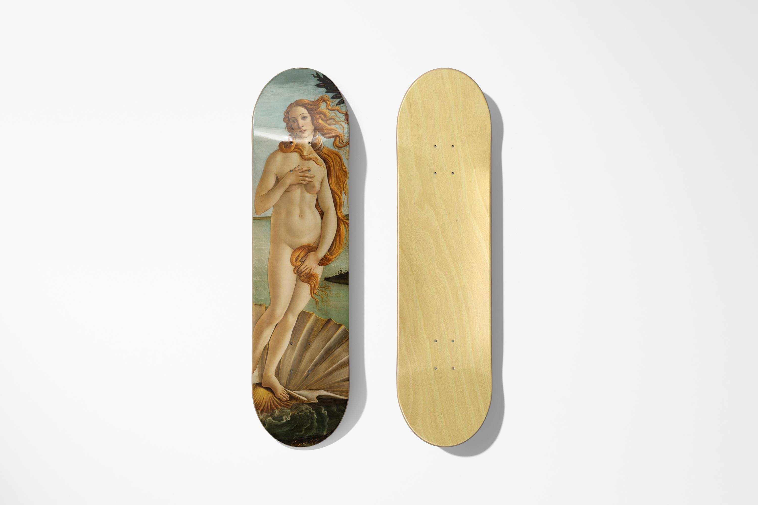
Spring in Berlin always reminds me of Botticelli's Birth of Venus. There's this fresh energy when everything comes back to life, and Venus emerging from the sea captures that perfectly. The soft pastels, the flowing movement... it just works with spring light.
Actually, here's what I've learned from my design background - Botticelli used this technique called "linear grace" where every line flows into the next. Perfect for rooms that need that fresh, airy feeling when you're finally opening windows after winter. I wrote more about how different spaces affect art perception in my Small Spaces, Big Impact: Skateboard Decor for Urban Apartments article.
Spring artwork works best in:
- Bedrooms with morning light
- Living spaces with large windows
- Home offices where you need inspiration
- Entryways to welcome guests
The key is positioning. Renaissance artists understood natural light better than anyone (they had to - no electric lighting!). Place your spring pieces where daylight hits them during morning hours.
Summer: Bold Renaissance Energy
Summer calls for something with more intensity. That's when I always recommend pieces with dramatic energy - anything by Michelangelo or Caravaggio really. These have this incredible boldness that matches summer's intensity.
You see, Michelangelo painted the Sistine Chapel ceiling during intense Roman summers. He understood how strong light and heat affect perception. The contrasts in his work become even more powerful when displayed in bright, energetic spaces.
From my Red Bull Ukraine event days, I learned that summer art needs to command attention. People are more active, more social - your wall art should reflect that energy. Classical pieces with strong composition work perfectly because they were originally created to impress (remember, these were commissioned by the most powerful people in Europe).
Best summer positions:
- Central living room walls
- Dining areas for entertaining
- Outdoor covered patios (if properly sealed)
- Home bars or entertainment spaces
And honestly, this is where our DeckArts collection really shines - we focus on pieces that maintain their impact even in bright summer lighting.
Fall: Rich Renaissance Textures
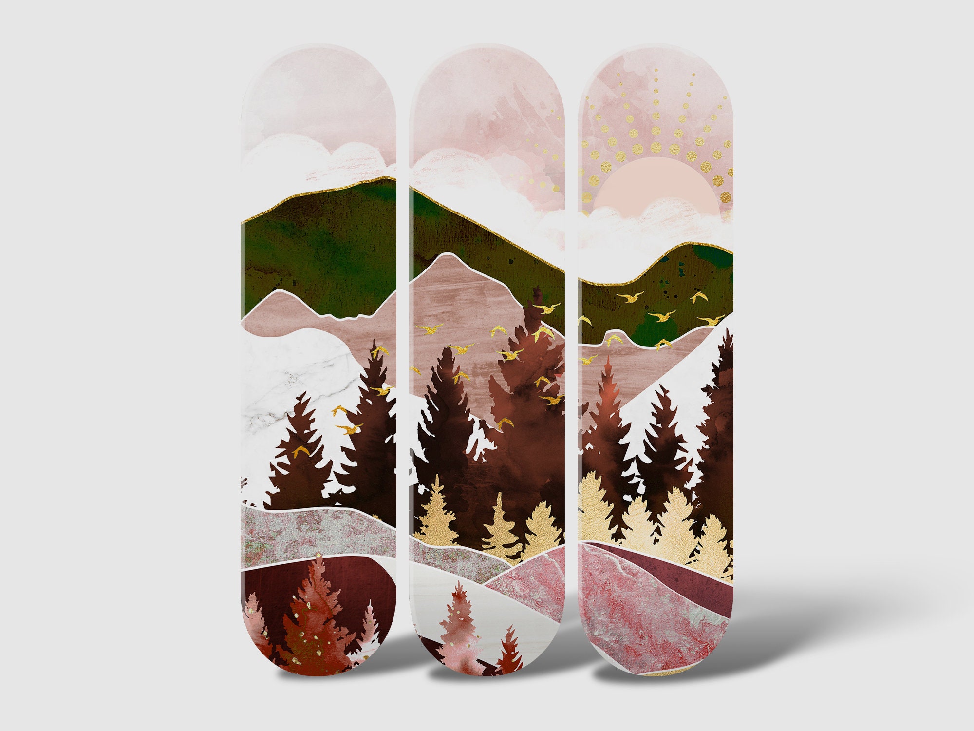
Fall is actually my favorite season for displaying classical art. The warm, golden light in Berlin during autumn makes every Renaissance piece look like it's in a museum. Colors become richer, details more pronounced.
This is when I rotate in pieces with deeper tones - anything with rich reds, golden browns, or dramatic shadows. Van der Weyden's portraits work incredibly well, or any piece with detailed fabric textures. The Renaissance artists were obsessed with showing off their ability to paint different materials (silk, velvet, metal), and fall lighting brings out every detail.
I learned this from organizing exhibitions - autumn gallery lighting is considered the gold standard. Museums often plan their major Renaissance shows for fall because the natural light enhances classical techniques like chiaroscuro. I actually explored this topic deeper in my Skateboard Art Color Psychology: Choosing the Right Mood for Your Space piece.
Fall display tips:
- Use warm LED lighting to enhance golden tones
- Group multiple pieces for gallery wall effect
- Focus on eye-level positioning for intimate viewing
- Consider pieces with architectural backgrounds
Winter: Contemplative Classical Moments
Winter in Berlin can be pretty intense (trust me, Ukrainian winters prepared me, but Berlin has its own vibe). This is when I recommend switching to more contemplative pieces. Something like Vermeer's Girl with a Pearl Earring - intimate, mysterious, perfect for cozy winter evenings.
Vermeer and other Dutch masters understood indoor lighting better than anyone. They painted during long winter months with limited natural light, so their work actually looks most authentic in winter conditions. The subtle color transitions, the way light falls on faces - it all makes sense when you're viewing it by lamp light on a cold evening.
Winter is also when people spend more time actually looking at their art (instead of just passing by). Choose pieces with details that reward close examination. Renaissance painters packed their work with symbolism and hidden meanings - perfect for winter contemplation.
The Science Behind Seasonal Art Rotation
Here's something I discovered during my graphic design years - our perception of color and contrast literally changes with seasons. It's called "chromatic adaptation," and it affects how we see art.
Summer eyes are adjusted to bright, high-contrast environments. Winter eyes become more sensitive to subtle variations. Renaissance artists knew this instinctively (even without the science). They painted differently for different lighting conditions and seasons.
This is why rotating your skateboard art collection isn't just about decoration - it's about optimizing your visual experience. And honestly, it keeps the art fresh and engaging year-round. I covered more about this psychological aspect in my The Psychology of Street Art: Why Skateboard Culture Resonates in Modern Homes article.
Practical Tips for Seasonal Rotation
From my experience setting up exhibitions and working with collectors, here's what actually works:
Storage between seasons:
- Keep unused pieces in acid-free boxes
- Avoid basements or attics (temperature fluctuations)
- Store vertically, not flat
- Document which pieces you rotate when
Wall positioning by season:
- Spring: East-facing walls for morning light
- Summer: North-facing walls to avoid harsh direct sun
- Fall: South-facing walls for maximum golden hour effect
- Winter: Areas with good artificial lighting
Lighting considerations: Different seasons need different lighting angles. Renaissance art was painted for specific lighting conditions - candle light, north-facing studio windows, church interiors. Match your artificial lighting to enhance these original intentions.
I actually wrote extensively about proper care and positioning in my Skateboard Art Maintenance: Preserving Your Investment Over Time guide.
Creating Your Personal Seasonal Collection
You don't need to own dozens of pieces (though honestly, once you start collecting skateboard art, it's pretty addictive). Even 4-6 carefully chosen pieces can create a complete seasonal rotation.
I always tell DeckArts customers to think about their lifestyle and space first. Do you entertain in summer? Choose pieces that start conversations. Spend winter evenings reading? Pick intimate portraits that reward quiet contemplation.
The beauty of classical art is its versatility. These masterpieces have survived 500+ years because they speak to universal human experiences - and those experiences change with seasons just like everything else in life.
Actually, that's exactly why I focus on professional custom skateboard art rather than DIY approaches. The quality and color accuracy matter when you're rotating pieces seasonally - you need consistency that only comes from museum-quality printing. I explored this topic in detail in my DIY vs Professional: When to Invest in Custom Skateboard Art analysis.
About the Author
Stanislav Arnautov is the founder of DeckArts and a creative director originally from Ukraine, now based in Berlin. With extensive experience in branding, merchandise design, and vector graphics, Stanislav has worked with Ukrainian streetwear brands and organized art events for Red Bull Ukraine. His unique expertise combines classical art knowledge with modern design sensibilities, creating museum-quality skateboard art that bridges Renaissance masterpieces with contemporary culture. Follow him on Instagram, visit his personal website stasarnautov.com, or check out DeckArts on Instagram and explore the curated collection at DeckArts.com.


0 comments