

I still remember the first time I hung a Renaissance skateboard deck in my Berlin studio. I spent twenty minutes measuring, drilling, adjusting the mount perfectly... and then stepped back to realize something felt completely off. The vertical board made my already narrow hallway feel like it was closing in on me. My girlfriend walked in, took one look, and said "Why does this make me anxious?"
That awkward moment sent me down a rabbit hole of interior design psychology that completely changed how I think about displaying skateboard art. Turns out, whether you hang your deck horizontally or vertically wasnt just an aesthetic choice—its a psychological statement that fundamentally alters how people experience your space.
The Vertical vs Horizontal Debate: More Than Meets the Eye
Heres the thing most skaters dont realize when they're mounting their favorite deck: orientation matters as much as the artwork itself. Interior designers have known this forever, but somehow it never made it into skateboard culture conversations.
When I was researching this (after my hallway disaster), I came across fascinating insights from design experts. According to Architectural Digest's comprehensive wall decor guide, vertical lines in a space draw the eye upward, creating an illusion of height and formality. Horizontal lines, on the other hand, encourage the eye to move laterally across a space, promoting feelings of calm and expansiveness.
This wasnt just theory for me anymore—it explained exactly why my vertical skateboard felt so wrong in that narrow space.
When Vertical Placement Works (And When It Absolutely Doesnt)
Vertical skateboard placement is powerful—but you need to know what you're doing. The vertical orientation creates what designers call "visual momentum" that pulls attention upward. In spaces with low ceilings, this can actually make rooms feel taller and more dramatic.
I've installed vertical Renaissance decks in dozens of spaces now, and the pattern is clear: vertical works brilliantly in:
Entryways and narrow hallways (wait, what?)—Yeah, I know this contradicts my earlier disaster story, but hear me out. The trick is ceiling height. My hallway had 2.4-meter ceilings (standard Berlin apartment). Too low for vertical drama. But when I moved to a space with 3.2-meter ceilings? Game changer. The Botticelli "Birth of Venus" deck from our collection looks absolutely stunning mounted vertically in a tall, narrow space—it draws the eye up and makes the passage feel intentional rather than cramped.
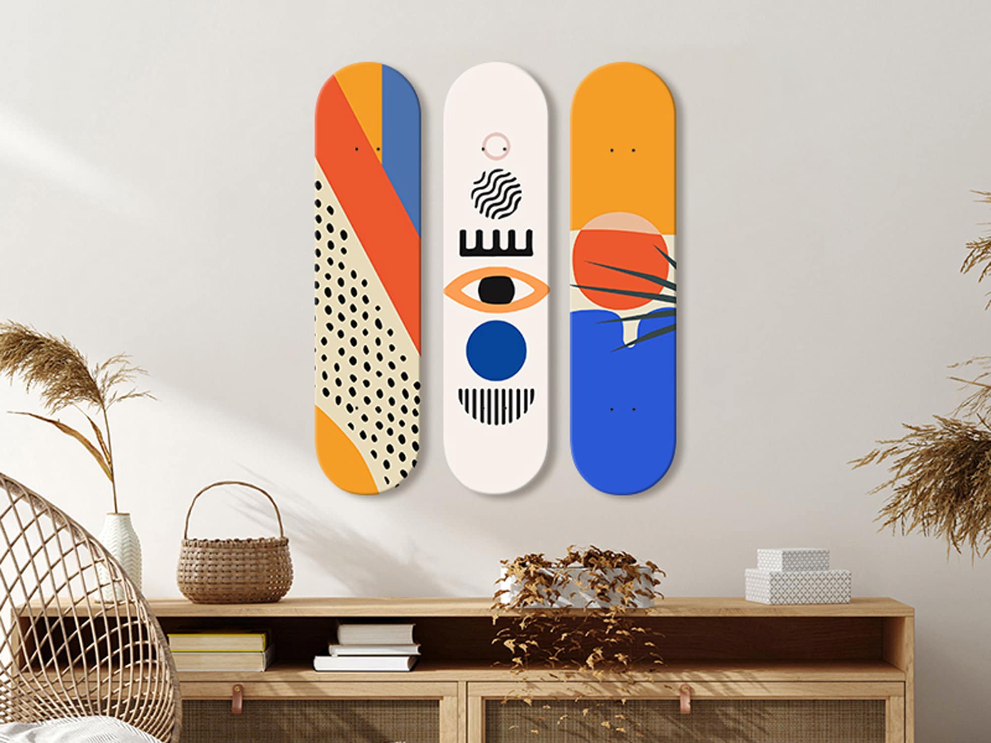
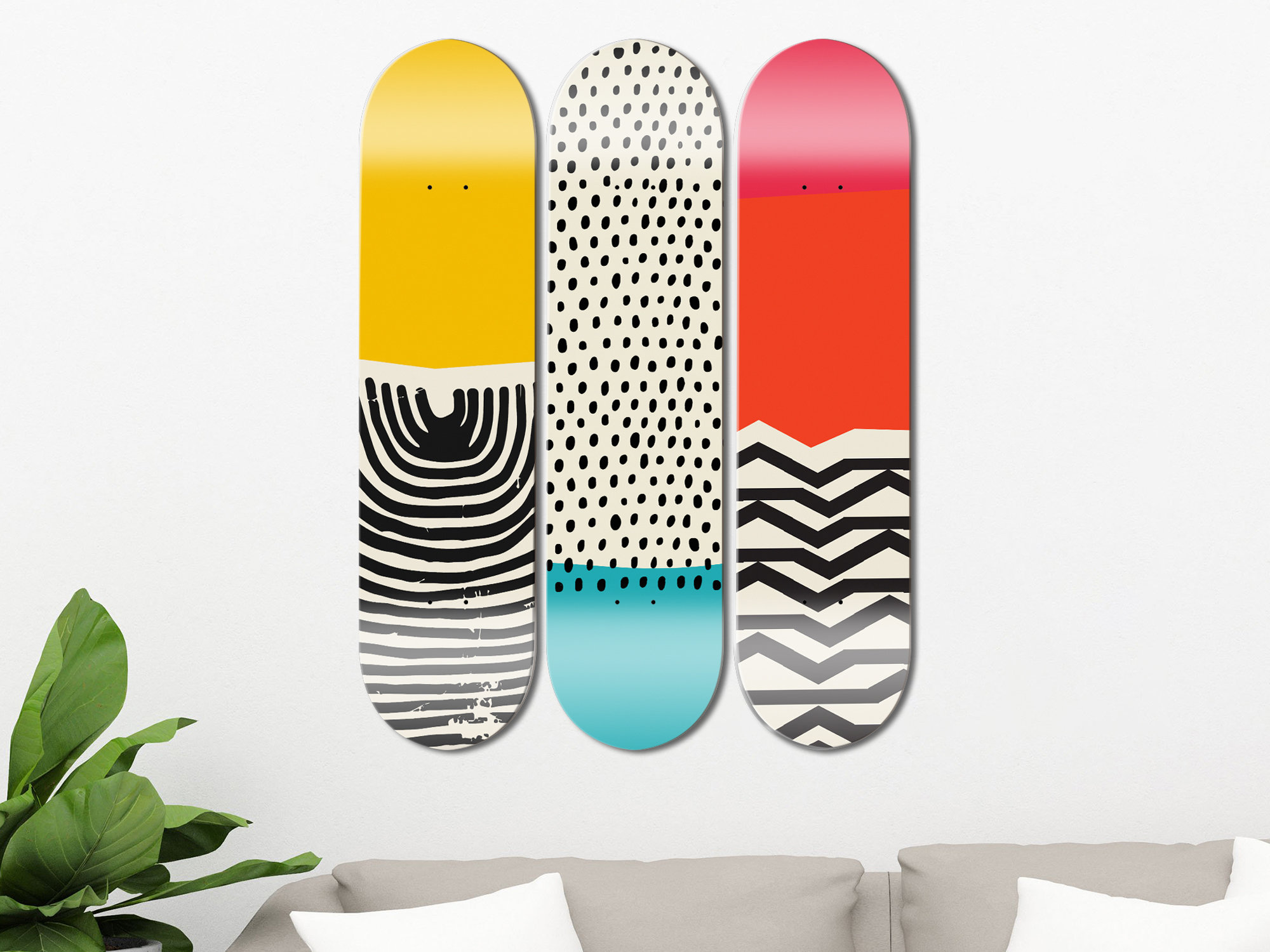
Gallery walls with mixed orientations—When you're creating a collection display, vertical pieces add rhythm and prevent visual monotony. Mix your Renaissance-inspired decks with vertical and horizontal orientations to create dynamic tension.
Above furniture with vertical proportions—Think tall bookcases, narrow console tables, or floor-to-ceiling windows. The vertical skateboard echoes these architectural elements and creates visual harmony.
But vertical fails hard when you're working with:
- Wide, low-ceilinged spaces (my original mistake)
- Above horizontal furniture like sofas or beds
- In rooms where you want people to feel relaxed rather than energized
The Horizontal Advantage: Why Width Beats Height Most of the Time
After my vertical disaster, I experimented with horizontal placement and honestly, I think it works better in about 70% of residential situations. Theres a reason most artwork traditionally hangs horizontally—it aligns with our natural horizontal field of vision.
Interior designer Shawn Henderson, quoted in The New York Times' guide to creating cozy spaces, emphasizes that horizontal elements ground a room and create what he calls "visual anchoring." This is exactly what skateboard decks do when mounted horizontally—they become anchors that stabilize the visual composition of a space.
Horizontal placement excels in:
Living rooms and bedrooms—These are relaxation spaces where you want horizontal visual movement. When I hang Renaissance decks horizontally in living rooms, clients consistently report the room feels more "settled" and comfortable. The horizontal orientation literally tells your nervous system to chill out.
Above sofas and beds—This is Interior Design 101, but it bears repeating: furniture creates horizontal lines, and your wall art should echo those lines. A horizontal skateboard above a sofa creates visual continuity. A vertical one? Creates visual conflict that registers subconsciously as "something's off."
Small spaces where you want to expand perceived width—My current Berlin apartment is tiny (welcome to European city living), but horizontal skateboard placement makes it feel wider. The eye follows the horizontal line across the wall, creating an illusion of expanded space. Ive got three decks mounted horizontally in sequence, and visitors always comment that my place feels bigger than it is.
Dining areas—Horizontal placement encourages lateral eye movement, which subconsciously promotes conversation and social connection. Vertical art in dining spaces can feel formal and static.
The Psychology Behind Orientation: What Designers Know That We Dont
This is where it gets really interesting. The whole vertical-versus-horizontal thing isnt arbitrary—its rooted in how humans have evolved to perceive their environment.
Vertical elements in nature typically signal things we need to pay attention to: trees (potential danger or shelter), standing figures (other humans), tall structures (landmarks for navigation). Our brains are hardwired to perceive vertical elements as active, demanding, and energizing.
Horizontal elements signal stability, rest, and safety: the horizon line, lying down to sleep, calm water. Horizontal visual cues literally trigger relaxation responses in our nervous system.
When you mount a skateboard vertically, you're tapping into those "pay attention" circuits. When you mount it horizontally, you're engaging the "relax and settle" response. Neither is better—they serve different psychological purposes.
David Jimenez, another designer quoted in The Times article, talks about creating rooms that feel like "a hug"—spaces where horizontal elements dominate and vertical ones are used sparingly for accent. This is brilliant advice for skateboard collectors: if you want your space to feel welcoming and comfortable, horizontal placement should be your default.
Practical Application: My Current Setup and What I've Learned
After years of experimentation (and several drill holes I wish I could take back), heres my current philosophy for mounting Renaissance skateboard art:
Primary pieces = horizontal—Your main skateboard displays should almost always be horizontal. This creates visual stability and works in the widest variety of spaces. My Vermeer "Girl with a Pearl Earring" deck hangs horizontally in my living room, and it anchors the entire wall composition.
Accent pieces = vertical for drama—Use vertical placement strategically for visual interest. In my studio, I've got one vertical deck near the entrance that creates immediate impact. But its surrounded by horizontal elements that prevent the space from feeling too "busy."
Consider ceiling height first—Measure your ceiling height before deciding. Under 2.7 meters? Horizontal is probably your friend. Over 3 meters? You've got the vertical option available.
Match your furniture orientation—Look at your existing furniture. Long sofa? Horizontal skateboard above it. Tall bookcase? Vertical placement could work.
Think about the room's purpose—Relaxation space (bedroom, living room)? Go horizontal. Energy space (home office, gym, entryway)? Vertical might work.
The Multi-Deck Strategy: Combining Orientations
Once you understand the psychology, you can start playing with combinations. My favorite approach is what I call the "stable foundation with vertical accent" method:
Start with 2-3 horizontally mounted decks that create your visual foundation. These should be your largest or most prominent pieces. Then add a single vertical deck as an accent piece—this creates visual interest without overwhelming the space.
Think of it like music: horizontal decks are your bassline—steady, grounding, fundamental. Vertical decks are your melody—occasional, attention-grabbing, dynamic. You need the bassline to support the melody.
If you're building a serious collection display (I've helped several collectors create gallery walls), consider this ratio: 70% horizontal, 30% vertical. This maintains psychological stability while adding enough variation to keep things interesting.
For more thoughts on creating gallery walls with skateboard art, check out my earlier guide on the ultimate skateboard gift guide where I discuss collection building strategies.
Common Mistakes I See (And How to Avoid Them)
Mistake #1: All vertical or all horizontal—Unless you're going for a very specific minimalist aesthetic, mono-orientation displays feel flat. Mix it up.
Mistake #2: Ignoring the "eye level" rule—Whether horizontal or vertical, the center of your skateboard should be at eye level (roughly 145-160cm from the floor). This is true in galleries and museums, and its true in your apartment.
Mistake #3: Fighting your architecture—If you have strong horizontal elements (long windows, pronounced crown molding), dont try to counteract them with all-vertical displays. Work with your space, not against it.
Mistake #4: Forgetting about lighting—Orientation affects how light hits your skateboard. Vertical decks can create interesting shadow plays with overhead lighting, while horizontal decks work better with side lighting. This is something I explored in detail in my article about skateboard lighting techniques.
Mistake #5: Not considering the artwork itself—Renaissance paintings were created with specific orientations in mind. Botticelli's "Birth of Venus" is a horizontal composition. Hanging it vertically (even though its on a skateboard) fights the original artistic intention. Match your mounting orientation to the artwork's natural composition when possible.
Real-World Testing: What Actually Happens
I've tested this stuff extensively—both in my own spaces and with customers who send me photos of their setups. The psychological effects are surprisingly consistent:
People consistently report that horizontally-mounted decks make spaces feel "calmer," "more put-together," and "larger." Multiple customers have told me their partners (who were initially skeptical about skateboard wall art) came around once they switched from vertical to horizontal orientation.
Vertically-mounted decks get described as "bold," "dramatic," "eye-catching"—but also, when used incorrectly, "overwhelming," "aggressive," or "claustrophobic."
The sweet spot seems to be a foundation of horizontal pieces with strategic vertical accents. This approach gets universally positive feedback—people feel like the space has "personality" without feeling "chaotic."
Final Thoughts: Trust Your Space (And Your Gut)
Look, design "rules" are really just guidelines based on what typically works. I've seen vertical placements that break every rule and look amazing. I've seen horizontal arrangements that follow all the principles and feel boring.
The real lesson from my years of hanging Renaissance skateboard art is this: understand the psychological principles, then trust your specific space and your personal response. If you mount something and it feels wrong—like my vertical hallway disaster—it probably is wrong for that particular situation.
Start with horizontal as your default, especially if you're unsure. Its the safer choice psychologically and works in the widest variety of contexts. Then, as you gain confidence and understand your space better, experiment with vertical placements for accent and drama.
And most importantly: dont be afraid to change your mind. Those mounting holes can be patched and repainted. Your psychological comfort in your own space is worth a little spackle.
The beauty of skateboard art—especially Renaissance-inspired pieces—is that they're designed to be noticed and appreciated. Whether you hang them horizontally or vertically, you're bringing centuries of artistic tradition into your modern space. Just make sure the orientation serves the psychology you want to create.
For more insights on creating the perfect skateboard art display, explore our complete collection of Renaissance skateboard decks and see how different orientations might work in your space.
About the Author
Stanislav Arnautov is the founder of DeckArts and a creative director originally from Ukraine, now based in Berlin. With extensive experience in branding, merchandise design, and vector graphics, Stanislav has worked with Ukrainian streetwear brands and organized art events for Red Bull Ukraine. He combines his passion for Renaissance art with skateboard culture, exploring how classical masterpieces can transform modern spaces through thoughtful interior design. Connect with him on Instagram or visit his personal website. Follow DeckArts on Instagram or shop the collection at DeckArts.com.


0 comments