

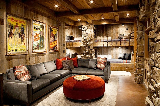
Honestly, the term "man cave" makes me cringe a little. You know that stereotypical basement with beer signs, sports memorabilia, and maybe a foosball table gathering dust? That's not what I'm talking about. Architectural Digest recently covered the evolution of masculine spaces, noting that "it's no more performative than our parents having a man cave in the '90s" - but the difference now is sophistication.
When I moved to Berlin four years ago and finally had my own space (tiny, but mine), I realized something: I didn't want a "man cave." I wanted a personal gallery that happened to be where I also watched movies and worked on designs.
That's when skateboard wall art stopped being just my business and became my aesthetic solution. Let me show you how to curate a space that's masculine without being stereotypical, personal without being childish, and Instagram-worthy without trying too hard.
Why Skateboard Art Works in Masculine Spaces (And Beer Signs Don't)
Last month, a client in Munich sent me photos of his home office. He'd just taken down his Champions League posters (his wife's ultimatum) and asked what he could replace them with that wouldn't make the room look like a teenager's bedroom or a generic hotel.
I suggested three pieces: our Caravaggio Medusa deck, a Frida Kahlo skateboard, and the Bosch Garden of Earthly Delights triptych. Two weeks later, he sent me a photo with the caption: "My architect friend asked where I got my art. Not my skateboards. My ART."
That's the power of choosing the right pieces.
What Makes Skateboard Art Masculine Without Being Cliché:
Genuine Craft Heritage: Skateboards represent actual craftsmanship - seven layers of Canadian hard rock maple, precision pressing, functional design. It's not decorative masculinity, it's engineering disguised as art. When I was working with Ukrainian streetwear brands, I learned that men respond to authentic craft stories more than aesthetic trends.
Historical Weight: Renaissance masterpieces carry cultural gravitas that beer signs and neon lights simply don't. Caravaggio's Medusa isn't just "cool art" - it's a 1595 masterpiece commissioned by Cardinal Francesco Maria Del Monte. That backstory adds depth to your space that no amount of "COLD BEER HERE" signage can match.
Conversation Pieces That Actually Work: GQ published guidelines for "masculine design and male domesticity," emphasizing that sophisticated spaces need elements that spark genuine conversation. When someone walks into your space and sees a Bosch triptych on skateboard decks, they ask questions. Real questions. Not "nice poster, where'd you get it?" but "tell me about this piece."
Scalable Sophistication: You can start with one deck above your desk. Add another above the bar cart. Suddenly you have a curated collection that evolved organically, not an installation that screams "I hired a designer to make my man cave look expensive."
Layout Strategy #1: The Gallery Wall Approach
Architectural Digest features homes where art is displayed in careful arrangements, not random clusters. The same principles apply to skateboard collections.
The Three-Piece Power Move:
Mount three decks in a horizontal row at eye level (about 57-60 inches from floor). Use pieces with complementary color stories but distinct compositions. I recommend:
- Center: Bosch triptych (already three connected pieces, creates visual anchor)
- Left: Caravaggio Medusa (dark, dramatic, balances the chaos of Bosch)
- Right: Frida Kahlo (warm colors, organic forms, provides relief)
This arrangement works in spaces 12+ feet wide. Anything smaller and you're overcrowding.
The Asymmetric Cluster:
Five to seven decks arranged at varying heights and angles on one wall. This looks casual but requires actual planning. I learned this organizing art events for Red Bull Ukraine - asymmetry feels more authentic than perfect grids.
Key rule: largest piece goes slightly off-center, smaller pieces radiate outward. Your eye follows the visual weight naturally.
The Corner Installation:
Two walls meeting at a corner? Wrap skateboard art around that junction. One deck on each wall, positioned so they "point" toward each other. Creates flow and uses dead space that usually gets ignored.
I have this setup in my Berlin apartment behind my desk. When I'm working, I see the Medusa staring back at me from the left wall. Motivating in a weird, slightly intimidating way.
Layout Strategy #2: The Minimalist Statement
Sometimes less actually is more. The the principle behind high-end galleries - give art breathing room.
The Single Centerpiece:
One skateboard. Large wall. Nothing else competing for attention.
This works best with complex pieces like our Bosch triptych. The Garden of Earthly Delights has so much detail (tiny figures, fantastical creatures, surreal landscapes) that it deserves solo spotlight.
Mount it behind your primary seating area - above the sofa if it's a living room, behind the desk if it's an office. The piece becomes the room's identity.
The Shelf Display:
Instead of wall-mounting, prop skateboards on a floating shelf or mantle. Lean them at a slight angle against the wall. This approach feels less permanent, more collected-over-time.
Bonus: you can rotate pieces seasonally. I wrote about this in my small apartment article - seasonal rotation keeps spaces feeling fresh without full redesigns.
The Desk Area Focal Point:
One deck mounted directly above your workspace. Choose something inspiring but not distracting. Frida Kahlo works well here - her self-portraits have this intense eye contact that makes you feel seen. Sounds weird, but it works.
Color Psychology for Masculine Interiors
Architectural Digest's coverage of masculine spaces emphasizes "moody and refined" aesthetics - dark walls, rich textures, intentional lighting. Skateboard art amplifies this instead of fighting it.
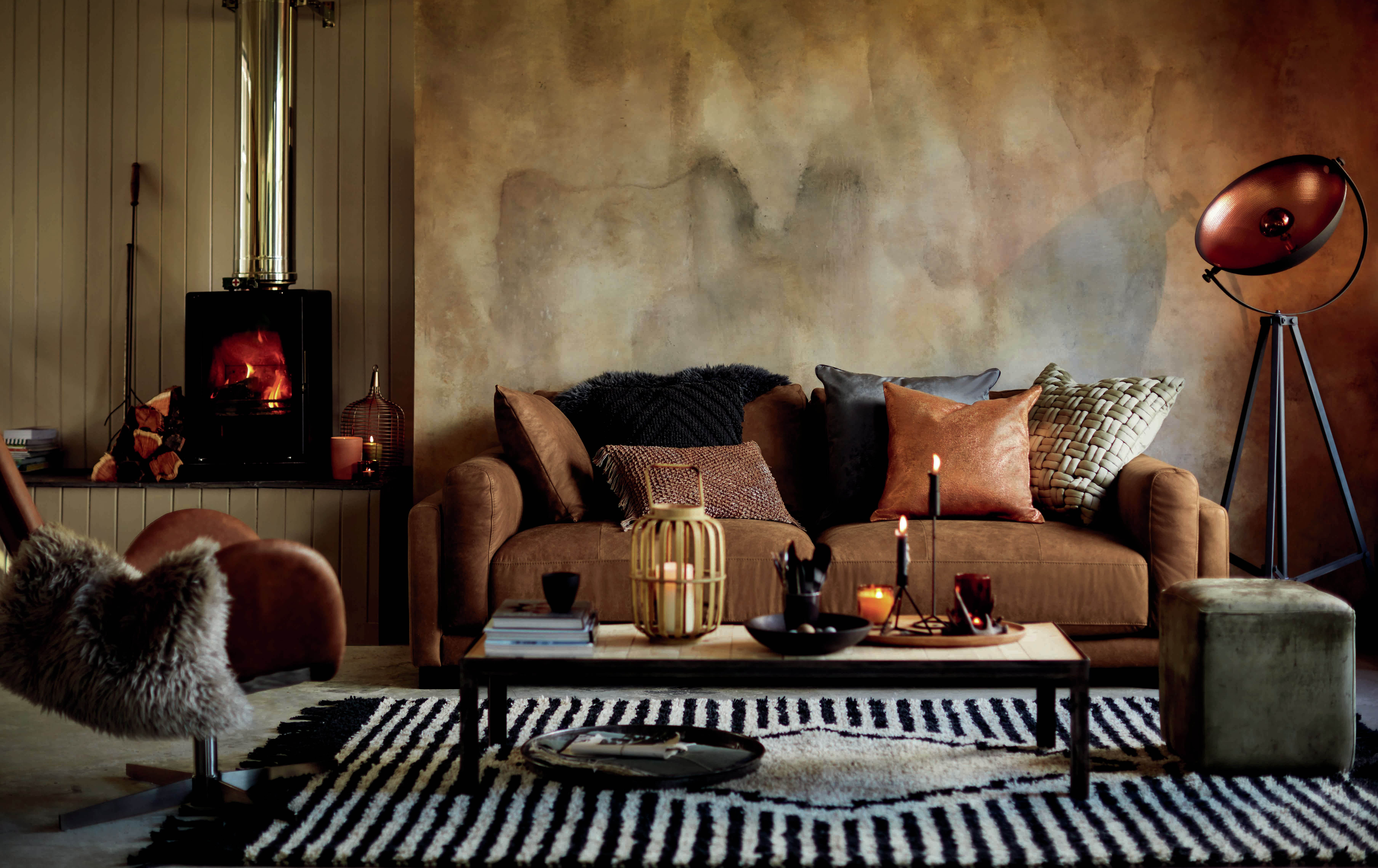
Dark Wall Strategies:
If you have charcoal, navy, or black walls (and you should consider them), Renaissance skateboard art pops dramatically. Caravaggio literally invented chiaroscuro - extreme light/dark contrast. His work was designed for this.
The Medusa piece has olive greens, flesh tones, and deep blacks. Against a dark wall, the lighter elements seem to emerge from shadows. It's theatrical without being over-the-top.
Neutral Wall Strategies:
White, gray, beige walls need art with stronger color presence. The Frida Kahlo deck delivers - terracottas, jungle greens, vibrant pinks. Provides color punch without needing to paint walls or buy new furniture.
Wood-Paneled Spaces:
If you have wood paneling (real or that trendy peel-and-stick stuff), you need art that doesn't compete with the wood grain. Renaissance pieces work because they're also on wood (Canadian maple deck). Material harmony.
The Bosch triptych has earthy browns, muted golds, surreal blues. These tones complement wood paneling instead of clashing.
Lighting: Making Your Collection Museum-Quality
When I designed DeckArts' first showroom in Berlin, I spent three days just adjusting lighting. Here's what actually matters:
Picture Lights:
Those small LED strips that mount above artwork. Battery-powered versions exist (crucial for renters). Position them to shine down at a 30-degree angle.
For skateboard art, this creates shadows that emphasize the deck's three-dimensional form. You're not just lighting a print - you're lighting a sculptural object.
Track Lighting:
If you're renovating or building, install track lighting aimed at your skateboard wall. Gives you flexibility to adjust as you add pieces.
Avoid harsh overhead lighting that creates glare on the deck's finish. Angled light always works better.
Natural Light Considerations:
If your space has windows, position skateboards on walls perpendicular to those windows, not opposite. Direct sunlight fades colors over time, even with our UV-resistant inks.
I learned this the hard way in my first Berlin apartment. Mounted a deck opposite a south-facing window. Two years later, subtle color shift. Not catastrophic, but noticeable.
The Types of Man Caves (And Which Art Works Where)
Type 1: The Home Office
You're on Zoom calls. Clients, colleagues, investors see your background. Skateboard art signals: I'm creative but professional, cultured but not pretentious.
Best pieces: Single statement deck behind your desk. Caravaggio Medusa for dramatic impact, Frida Kahlo for approachability.
Type 2: The Entertainment Zone
Bar cart, comfortable seating, maybe a record player. This is where you actually hang out with friends.
Best approach: Gallery wall with five to seven decks. Mix our Renaissance collection with other pieces. Creates conversation without being a museum.
Type 3: The Hybrid Space
Living room that's also your office, bedroom, gym (hello, Berlin apartment life). Needs to function multiple ways.
Best approach: Minimalist single statement piece or corner installation. Doesn't dominate any one function but elevates all of them.
Type 4: The Workshop/Studio
Actual tools, projects in progress, creative work happening. Skateboard art fits naturally because skateboards originated in DIY culture.
Best approach: Casual lean-against-the-wall displays mixed with mounted pieces. Feels authentic to maker spaces.
What NOT to Do (Common Man Cave Mistakes)
Mistake #1: Themed Overkill
I've seen "skateboard-themed" man caves with skateboard wheels as drawer pulls, grip tape coasters, trucks as coat hooks. It's too much. Architectural Digest warns against spaces that feel "staged" rather than lived-in.
Use skateboard art as ART, not as a theme. The rest of your space should be normal furniture and decor.
Mistake #2: Mixing Quality Levels
One premium Renaissance deck + three cheap Amazon prints = looks like you couldn't afford four good pieces. Either commit to quality or wait until you can.
Mistake #3: Ignoring Scale
Tiny 8x10 room with twelve skateboard decks? Claustrophobic. Massive 20x25 space with one small deck? Lost.
General rule: 10-15% of wall space should be covered by art. More than that feels cluttered, less feels empty.
Mistake #4: Perfect Symmetry
Unless you're doing a intentional minimalist grid, perfect symmetry reads as corporate, not personal. Real collectors acquire pieces over time. Your display should reflect that organic growth.
Mistake #5: Forgetting About Doors
Measure your door swing arc before mounting anything. I almost made this mistake in my Berlin studio. Door would have smashed into my Medusa deck every time I opened it fully.
Curating Your Collection: How to Choose Pieces
Start With One Anchor Piece:
Choose something substantial that will define your space's vibe. The Bosch triptych works as an anchor because it's large (three connected decks) and complex (so much visual detail).
Buy this first. Live with it for a month. See how light hits it at different times of day. Understand what it needs.
Add Complementary Pieces:
Your second and third pieces should complement the anchor, not compete with it. If Bosch is your anchor (chaotic, colorful, medieval), add something with calmer composition - maybe the Medusa (focused, dramatic, monochrome palette).
Consider Your Existing Decor:
What's already in your space? Leather furniture? Wood tones? Metal accents? GQ's interior design guide emphasizes that masculine spaces work best when materials have visual relationships.
Renaissance skateboard art on Canadian maple complements wood furniture naturally. The colors in classical paintings work with earth-tone textiles.
Think Long-Term:
You're not redecorating every year (I hope). Choose pieces you'll want to look at for the next decade. That's why I focus on Renaissance masterpieces - they've stayed relevant for 500+ years. Probably good for another decade in your home office.
Budget Strategy: Building A Collection Over Time
Year One: The Foundation
One anchor piece. Invest properly. Our decks range €149-299, which is less than most framed prints once you factor in custom framing costs.
Mount it correctly using the methods I detailed in another article. Damage-free mounting matters for renters and for flexibility.
Year Two: The Expansion
Add two complementary pieces. Now you have a trio. This is enough for a gallery wall arrangement or a distributed display across multiple walls.
Year Three+: The Evolution
Continue adding pieces as you find them and as budget allows. Real collectors don't buy everything at once. Your space should tell a story of gradual curation.
The Authenticity Question
Architectural Digest's article about performative male homes asks a crucial question: are you curating your space for you, or for what you think people expect?
Here's my take, shaped by four years running DeckArts and conversations with hundreds of collectors:
Authentic Curation:
- You can explain why you chose each piece
- You actually notice and appreciate details in the art
- Your space reflects your actual interests, not aspirational ones
- You're comfortable with pieces that might not be "on trend"
Performative Curation:
- You bought pieces because they're recognizable brands/artists
- You can name the artist but know nothing about the work
- Your space looks exactly like Pinterest boards titled "man cave"
- You care more about guest reactions than daily enjoyment
When someone visits my Berlin apartment and asks about the Caravaggio Medusa, I can talk for twenty minutes about why he painted it, the symbolism of Medusa's severed head, how this piece influenced horror art for centuries. Not because I memorized talking points, but because I genuinely find it fascinating.
That's authentic curation.
Mixing Skateboard Art With Other Collections
Your space probably has other interests represented. Books, vinyl records, maybe some photography. Skateboard art should integrate with these, not dominate them.
With Books:
Floor-to-ceiling bookshelves with skateboard decks mounted on the wall beside them. Both represent collected knowledge and aesthetic appreciation. They complement each other.
With Vinyl:
Record player setup with skateboard art above it. Both are music-adjacent (skate culture and music are deeply connected), both involve physical objects in a digital world.
With Photography:
Black and white photography + Renaissance skateboard art creates interesting contrast. Historical painting + contemporary photography + skate culture = layered sophistication.
With Vintage Finds:
Flea market furniture + Renaissance decks. Both have history, both tell stories. This was actually my approach in my first Berlin apartment. Mixed IKEA basics with vintage finds and skateboard art. Created character without pretension.

Maintenance and Care
Dusting:
Microfiber cloth, gentle wipes. Skateboard decks are wood with printed graphics and clear coat finish. Treat them like fine furniture, not like... well, skateboards.
UV Protection:
Even with UV-resistant inks, avoid direct sunlight. Position pieces away from windows or use UV-filtering window film.
Climate Control:
Wood expands and contracts with humidity changes. Keep your space between 40-60% humidity if possible. Extreme dryness or dampness can cause warping over time.
Handling:
If you're rotating pieces or rearranging, handle by the edges. Oils from your hands can gradually dull the finish if you're constantly touching the graphics.
When to Commission Custom Pieces
Most collectors are happy with our existing Renaissance collection. But sometimes you want something specific - maybe a particular painting, or a custom color treatment, or a personalized element.
We don't do custom commissions at DeckArts (yet), but the principle matters: commission work only after you understand what you actually want. Live with a few pieces first. Understand how they function in your space. Then you'll know exactly what's missing.
Commissioning Guidelines:
- Have specific reference images (not just "something cool")
- Understand the cost difference (custom work is 2-3x standard pieces)
- Be realistic about timelines (expect 8-12 weeks minimum)
- Get physical samples if possible before committing
The Social Aspect: Hosting With Art
When friends come over, your space speaks before you do. Skateboard art tells a specific story: I value craftsmanship, I appreciate history, I didn't just buy the first thing I saw at HomeGoods.
Conversation Starters:
The Medusa piece always gets reactions. People recognize something classical but can't quite place it. That's your opening to talk about Caravaggio, about the myth of Medusa, about why this 1595 painting works on a skateboard.
The Bosch triptych generates the longest conversations. People start spotting details - the tiny figures, the bizarre creatures, the split panels showing heaven/earth/hell. It's like Where's Waldo for adults with art history degrees.
Hosting Events:
If you're hosting poker nights, watch parties, dinner parties - your art provides ambient sophistication. It's not the focus, but it elevates the atmosphere.
I've had friends tell me they feel more comfortable in my apartment than in their own because the space has intention behind it. That's what good curation does.
Evolution: How Your Collection Should Grow
Your first piece probably won't be your favorite five years later. That's fine. Collections evolve.
Phase 1: The Discovery (Year 1-2)
You're learning what you like. Maybe you thought you wanted dark, dramatic pieces but realized you prefer colorful, complex compositions. That's valuable learning.
Phase 2: The Refinement (Year 3-5)
You start understanding specific artists, periods, styles. You might sell or rotate out early purchases that no longer fit your aesthetic.
Phase 3: The Curation (Year 6+)
You have a cohesive collection with a point of view. New additions are intentional, filling specific gaps or adding specific dimensions.
I'm currently in Phase 3 with my personal collection. I know exactly what I want next (early Flemish Renaissance, probably a Hieronymus Bosch piece that isn't Garden of Earthly Delights). That specificity only comes from years of looking, learning, living with art.
Final Thoughts: Beyond the Man Cave Stereotype
After four years running DeckArts and countless conversations with collectors across Europe, I've realized something - the term "man cave" does these spaces a disservice.
You're not creating a cave. You're creating a personal gallery that reflects your actual interests, your appreciation for craft and history, your refusal to settle for generic HomeGoods wall art.
When you mount a Caravaggio Medusa above your desk or arrange a Bosch triptych behind your bar cart, you're not decorating a man cave. You're curating a space that bridges street culture and high art, contemporary design and Renaissance mastery.
That's not performative. That's intentional.
And honestly? In a world where most masculine spaces still default to beer signs and sports memorabilia, choosing museum-quality art on skateboard decks isn't following trends. It's setting them.
Just make sure you can actually talk about why you chose each piece. Because nothing kills credibility faster than someone asking about your Caravaggio and you responding with "uh, it looked cool."
Know your collection. Own your aesthetic. Build something you'll actually want to look at every day for the next decade.
That's what separates personal galleries from man caves.
About the Author
Stanislav Arnautov is the founder of DeckArts, a Berlin-based creative director specializing in bridging Renaissance art with contemporary street culture. Originally from Ukraine, Stanislav worked with Ukrainian streetwear brands and organized art events for Red Bull Ukraine before relocating to Berlin four years ago. His expertise in branding, merchandise design, and vector graphics informs DeckArts' approach to creating museum-quality skateboard art for sophisticated collectors who reject traditional "man cave" stereotypes. Follow Stanislav on Instagram, explore his portfolio at stasarnautov.com, and discover the DeckArts collection on Instagram and DeckArts.com.