

Colors speak before words do. This fundamental truth hit me during my first visit to Prague's vibrant street art scene, where I witnessed how a single splash of electric blue could completely transform a dreary concrete wall. As someone based in Berlin but constantly traveling to collaborate with Prague artists, I've become fascinated by how color psychology applies uniquely to skateboard art in interior spaces.
When I launched DeckArts, I thought the appeal was purely aesthetic – cool skateboard graphics meeting sophisticated interior design. But after a year of working with customers and observing how different color palettes affect their spaces and moods, I've discovered something much deeper. Color in skateboard art doesn't just decorate; it communicates, energizes, and fundamentally alters the psychological atmosphere of a room.

The Emotional Language of Skateboard Art Colors
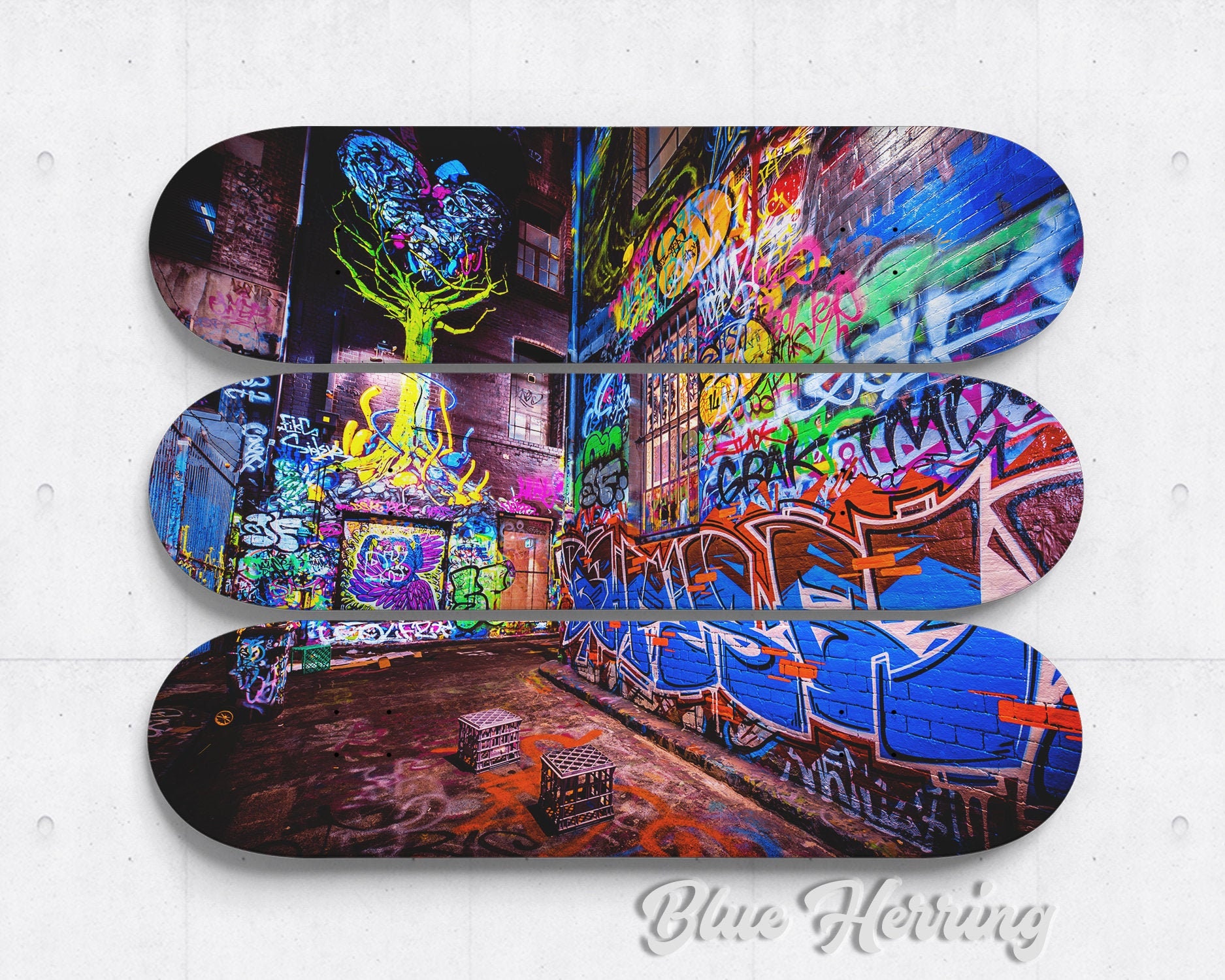
Traditional color theory takes on new dimensions when applied to skateboard culture. Street art – the foundation of most authentic skateboard graphics – uses color as rebellion, expression, and identity. When we bring these pieces into homes, we're not just hanging decoration; we're inviting specific emotional energies into our daily lives.
The Psychology Behind Street Art Colors
During my collaboration research in Prague, I spent weeks studying how local street artists choose their palettes. What I discovered was a sophisticated understanding of color psychology that most interior designers never consider:
- Bold Primary Colors: Red, blue, yellow in their purest forms represent the raw energy of skateboard culture
- Urban Earth Tones: Browns, deep oranges, and muted greens that echo concrete, brick, and urban decay
- Neon Accents: Electric pinks, lime greens, and cyber blues that capture the rebellion and youth energy
- Grayscale Foundations: Black, white, and gray that provide sophistication and versatility
Each category affects our subconscious differently. The mistake many people make is choosing skateboard art based solely on whether colors "match" their existing decor, without considering the psychological impact these pieces will have on their daily experience.
Red: The Energy Amplifier
Red skateboard art commands attention like no other color. In my Berlin apartment, I have a piece by Prague artist Milan that features bold red geometric patterns. The transformation this single piece created still amazes me – what was once a calm reading corner became an energized creative space where I now prefer to work on DeckArts business plans.
Psychological Effects of Red in Skateboard Art:
- Increased Energy: Red literally raises heart rate and blood pressure, creating a more dynamic atmosphere
- Enhanced Focus: Studies show red environments improve attention to detail and performance on focused tasks
- Social Stimulation: Red spaces encourage conversation and interaction
- Appetite Stimulation: Makes red pieces excellent for dining areas or kitchens
Best Applications:
- Home Offices: Where you need energy and focus for creative work
- Workout Spaces: Red's energy-boosting properties complement physical activity
- Social Areas: Living rooms where you entertain and want to encourage conversation
- Creative Studios: The color stimulates artistic thinking and bold decisions
Case Study: Sarah from Munich contacted me because her home office felt "dead and uninspiring." She worked remotely and struggled with afternoon energy crashes. We selected a red-dominant piece from our Prague artist collection – a street art-inspired design with bold red lettering against black backgrounds. Within two weeks, she reported feeling more energized during work hours and actually looking forward to spending time in her office.
However, red requires careful consideration. Too much red or red in the wrong spaces (like bedrooms) can create agitation rather than positive energy.
Blue: The Calming Counterbalance
Blue in skateboard art offers something unique – it maintains the coolness and authenticity of street culture while providing psychological calm. This makes it perfect for spaces where you want skateboard art's edge without overwhelming energy.
The Blue Spectrum in Street Art:
- Deep Navy: Provides sophistication and stability
- Electric Blue: Maintains energy while offering more calm than red
- Cyan/Turquoise: Creates refreshing, creative atmospheres
- Sky Blue: Opens up spaces and provides tranquility
Psychological Benefits:
- Stress Reduction: Blue environments lower cortisol levels
- Enhanced Creativity: Light blues stimulate creative thinking
- Better Sleep: Deep blues in bedrooms improve sleep quality
- Increased Productivity: Blue enhances focus without overstimulation
Real-World Application: Marcus, a software developer from Hamburg, needed skateboard art for his bedroom but wanted something that wouldn't interfere with sleep. Traditional interior design would suggest avoiding bold art in bedrooms entirely, but we found a solution in a deep blue Prague street art piece with subtle geometric patterns. The result was a space that maintained personality while promoting rest.
Green: The Natural Rebel
Green in skateboard art represents an interesting paradox – it's both natural and urban, calming yet energizing. Prague's street art scene uses green extensively, often representing growth, renewal, and environmental consciousness within urban decay.
Green's Unique Psychology:
- Balance: Green sits at the center of the color spectrum, providing psychological equilibrium
- Growth Mindset: Encourages personal development and positive change
- Eye Comfort: Green is the easiest color for eyes to process, reducing strain
- Nature Connection: Brings outdoor calm into urban interior spaces
Applications in Different Spaces:
- Study Areas: Green improves reading comprehension and reduces eye fatigue
- Meditation Spaces: Promotes mental clarity and calm focus
- Transitional Areas: Hallways and entryways benefit from green's welcoming nature
- Work Spaces: Balances productivity with reduced stress
Yellow and Orange: The Mood Elevators
These warm colors in skateboard art create instant mood boosts. However, they require the most careful consideration because their psychological effects are so pronounced.
Yellow Psychology:
- Happiness Boost: Yellow triggers serotonin production
- Mental Stimulation: Enhances learning and memory
- Communication: Encourages social interaction and conversation
- Creativity: Stimulates innovative thinking
Orange Psychology:
- Enthusiasm: Creates excitement and energy
- Warmth: Makes spaces feel more inviting and comfortable
- Confidence: Builds self-esteem and positive outlook
- Appetite: Stimulates hunger and social eating
The Berlin Coffee Shop Discovery: During a visit to a local café that featured orange skateboard art, I noticed how the space buzzed with conversation and energy. The owner confirmed that since installing the pieces, customer interactions increased and people stayed longer, creating a more vibrant community atmosphere.
Black, White, and Grayscale: The Sophisticated Foundation
Monochromatic skateboard art offers the most versatile color psychology while maintaining street art authenticity. These pieces work as foundational elements that other colors can complement.
Black Psychology:
- Sophistication: Creates elegant, mature atmospheres
- Focus: Eliminates color distractions for better concentration
- Drama: Adds intensity and emotional depth
- Timelessness: Provides classic appeal that won't date
White Psychology:
- Clarity: Promotes clear thinking and organization
- Spaciousness: Makes rooms feel larger and more open
- Purity: Creates clean, refreshing environments
- Flexibility: Allows other design elements to shine
Gray Psychology:
- Balance: Provides neutral calm without being sterile
- Professionalism: Creates serious, business-appropriate atmospheres
- Versatility: Works with any accent colors you might add later
Color Combinations and Their Psychological Impact
Single colors tell one story, but combinations create complex psychological narratives. Skateboard art often features multiple colors working together, and understanding these combinations helps you choose pieces that create your desired atmosphere.
High-Energy Combinations:
- Red + Black: Creates intense, powerful environments perfect for creative work
- Orange + Blue: Provides energy with balance, excellent for social spaces
- Yellow + Green: Stimulates creativity while maintaining calm focus
Calming Combinations:
- Blue + Gray: Professional calm with sophistication
- Green + White: Fresh, natural tranquility
- Purple + Silver: Luxury with relaxation
Attention-Grabbing Combinations:
- Red + White: Classic contrast that demands notice
- Black + Neon: Street art authenticity with modern edge
- Multi-color Gradients: Complex visual interest that holds attention
Seasonal Color Psychology
Living in Berlin has taught me how seasonal light affects color perception dramatically. Skateboard art colors that feel perfect during bright summer months might overwhelm during gray winter periods.
Summer Color Strategies:
- Cool Blues and Greens: Provide psychological cooling during hot months
- Bright Neons: Complement abundant natural light
- High Contrast: Sharp differences work well with strong sunlight
Winter Color Approaches:
- Warm Oranges and Reds: Combat seasonal depression with energy colors
- Rich Deep Tones: Navy, forest green, burgundy provide cozy comfort
- Metallic Accents: Reflect available light to brighten spaces
Cultural Color Meanings in Skateboard Art
Working with Prague artists has exposed me to cultural color associations that add layers of meaning to skateboard art:
European Street Art Traditions:
- Red: Revolution, passion, working-class pride
- Black: Punk rock rebellion, serious artistic statement
- Gold/Yellow: Urban luxury, successful street art career progression
- Blue: Freedom, open skies despite urban constraints
American Skateboard Culture:
- Neon Colors: 1980s skateboard culture nostalgia
- Primary Brights: Classic skateboard brand heritage
- Earth Tones: 1990s alternative culture influence
Understanding these cultural associations helps you choose pieces that resonate with your personal values and the story you want your space to tell.
Practical Application: Choosing Colors for Different Rooms
Based on my experience with DeckArts customers and color psychology research, here are specific recommendations for each room type:
Living Rooms:
- Goal: Social energy with sophistication
- Best Colors: Blue-orange combinations, red accents with gray
- Avoid: Overwhelming neons, too much yellow (can cause anxiety)
Bedrooms:
- Goal: Calm energy that doesn't interfere with sleep
- Best Colors: Deep blues, forest greens, sophisticated grays
- Avoid: Bright reds, electric yellows, high-contrast combinations
Home Offices:
- Goal: Focus and creative energy
- Best Colors: Green for balance, red for energy, blue for calm focus
- Avoid: Orange (too stimulating for concentration), pure black (can be depressing)
Kitchens/Dining Areas:
- Goal: Social warmth and appetite stimulation
- Best Colors: Warm oranges, appetite-stimulating reds, social yellows
- Avoid: Blue (suppresses appetite), cold grays
Entryways:
- Goal: Welcoming first impressions
- Best Colors: Warm greens, inviting oranges, sophisticated multi-color pieces
- Avoid: Aggressive reds, cold monochromes
The Investment Angle: Color and Long-Term Satisfaction
One crucial aspect customers often overlook is how color choices affect long-term satisfaction with their skateboard art investment. As I discussed in my post about common mistakes when choosing skateboard art, impulsive color decisions often lead to buyer's remorse.
Colors with Lasting Appeal:
- Classic Combinations: Black and white, blue and gray
- Natural Progressions: Earth tones, forest colors
- Cultural Authenticity: Colors true to skateboard/street art heritage
Colors That May Date:
- Trend-Driven Neons: Electric pinks, lime greens popular in specific eras
- Instagram-Influenced Palettes: Colors chosen for social media rather than living
- Overly Branded Colors: Pieces that feel too commercial rather than artistic
Color Psychology and Lighting Interactions
The psychology of color in skateboard art changes dramatically with different lighting conditions. This is crucial information I share with every DeckArts customer because lighting can completely alter a piece's psychological impact.
Natural Light:
- Morning Light: Cool blues and greens feel more energizing
- Afternoon Light: Warm colors become more prominent and welcoming
- Evening Light: Deep colors gain richness and sophistication
Artificial Light:
- Cool LED: Enhances blues and whites, diminishes warm colors
- Warm Incandescent: Brings out reds and oranges, mutes cool tones
- Color-Changing Systems: Allow you to alter the piece's psychological impact throughout the day
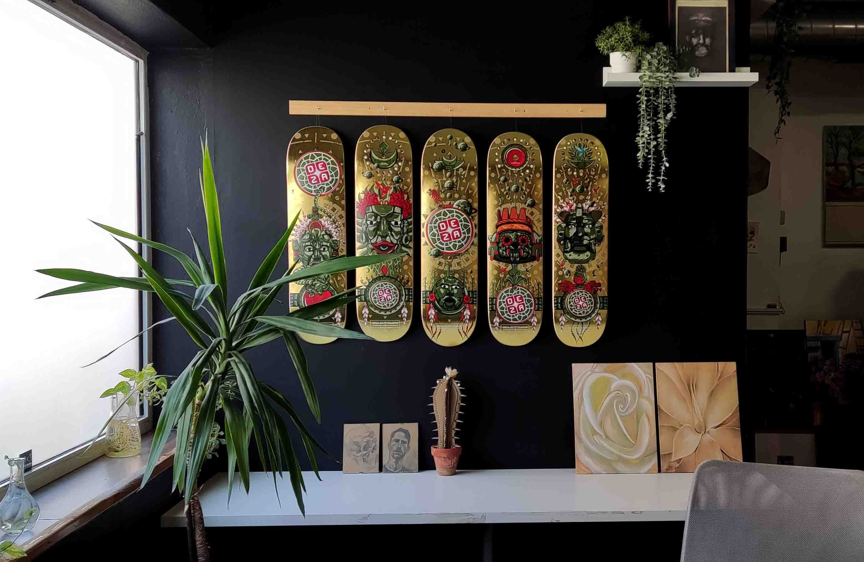
For more technical guidance on showcasing your color choices effectively, check out our detailed guide on how to mount skateboard art.
The Future of Color in Skateboard Art
As DeckArts continues growing and I work with more Prague artists, I'm seeing fascinating evolution in how colors are used in skateboard art intended for interior spaces. Artists are becoming more sophisticated about color psychology while maintaining street art authenticity.
Emerging Trends:
- Adaptive Palettes: Colors that work in multiple lighting conditions
- Psychological Intentionality: Artists considering the emotional impact of their color choices
- Cultural Fusion: Blending European and American color traditions
- Seasonal Adaptability: Pieces designed to feel appropriate year-round
The goal isn't to domesticate street art, but to create pieces that honor skateboard culture while enhancing daily life through thoughtful color psychology.
When you understand the psychological power of color in skateboard art, you stop seeing these pieces as mere decoration. They become tools for creating the exact atmosphere you want in your space – energizing your creativity, calming your stress, or inspiring your daily motivation.
Browse our authentic color collections to discover how the right colors can transform not just your walls, but your daily experience of home.
About the Author: Stanislav Arnautov is the founder of DeckArts, bringing authentic skateboard art to interior spaces. Based in Berlin, he works with local street artists in Prague to create limited-edition pieces that bridge urban culture and home design. Follow his journey on Instagram @rntv or visit stasarnautov.com.