

You know what I find fascinating? The same piece of skateboard art can look completely different depending on whether you display it in a minimalist space or a maximalist one. I discovered this accidentally when I moved apartments in Berlin about three years ago (wait, actually closer to four now).
In my old Kreuzberg apartment - which was basically a maximalist paradise with vintage posters, plants everywhere, mismatched furniture, and about fifty art books scattered around - my Klimt The Kiss skateboard blended beautifully into the chaos. Then I moved to a much more minimalist space in Mitte, and suddenly the same skateboard looked completely different. Not bad different - just... different. It commanded attention in a way it never did before.
Here's the thing - skateboard wall art featuring classical masterpieces has this unique flexibility. It can anchor a minimalist room as the sole focal point, or it can add refined contrast to a maximalist explosion of color and pattern. But the display approach changes completely depending on which aesthetic you're working with.
From my four years organizing art events for Red Bull Ukraine and now running DeckArts, I've seen both approaches work brilliantly - and fail spectacularly when done wrong. So let me walk you through exactly how to display skateboard art in minimalist versus maximalist spaces, what works, what doesn't, and how to adapt your approach to your personal style.
Understanding the Core Principles of Each Aesthetic
Before we talk about skateboard art specifically, let's get clear on what minimalist and maximalist actually mean in interior design. According to research from The Metropolitan Museum on art display philosophies, these aren't just about quantity - they're about intentionality and emotional impact.
Minimalist Aesthetic:
- Limited color palette (often neutrals)
- Negative space is essential
- Every item serves a purpose
- Quality over quantity
- Clean lines and uncluttered surfaces
- Art becomes a focal point through isolation
Think Scandinavian design, Japanese wabi-sabi, or modern German apartments like mine here in Berlin. The philosophy is "less is more" - but that "less" needs to be exceptional.
Maximalist Aesthetic:
- Rich, layered color palettes
- Pattern mixing and visual abundance
- Collections and groupings
- Personal narrative through objects
- Filled surfaces and walls
- Art blends into curated chaos
Think bohemian spaces, eclectic collectors' homes, or vintage-inspired interiors. The philosophy is "more is more" - but it needs intentional curation, not random clutter.
The the interesting part? Classical skateboard art works in both because it inherently contains contrast: high art meets street culture, centuries-old masterpieces on modern maple decks. That tension reads differently depending on context.
Displaying Skateboard Art in Minimalist Spaces
So anyway, minimalist display is actually harder than it looks. When you only have one or two art pieces in a room, everything about them gets scrutinized - placement, scale, how they relate to surrounding space.
The Single Statement Piece Approach:
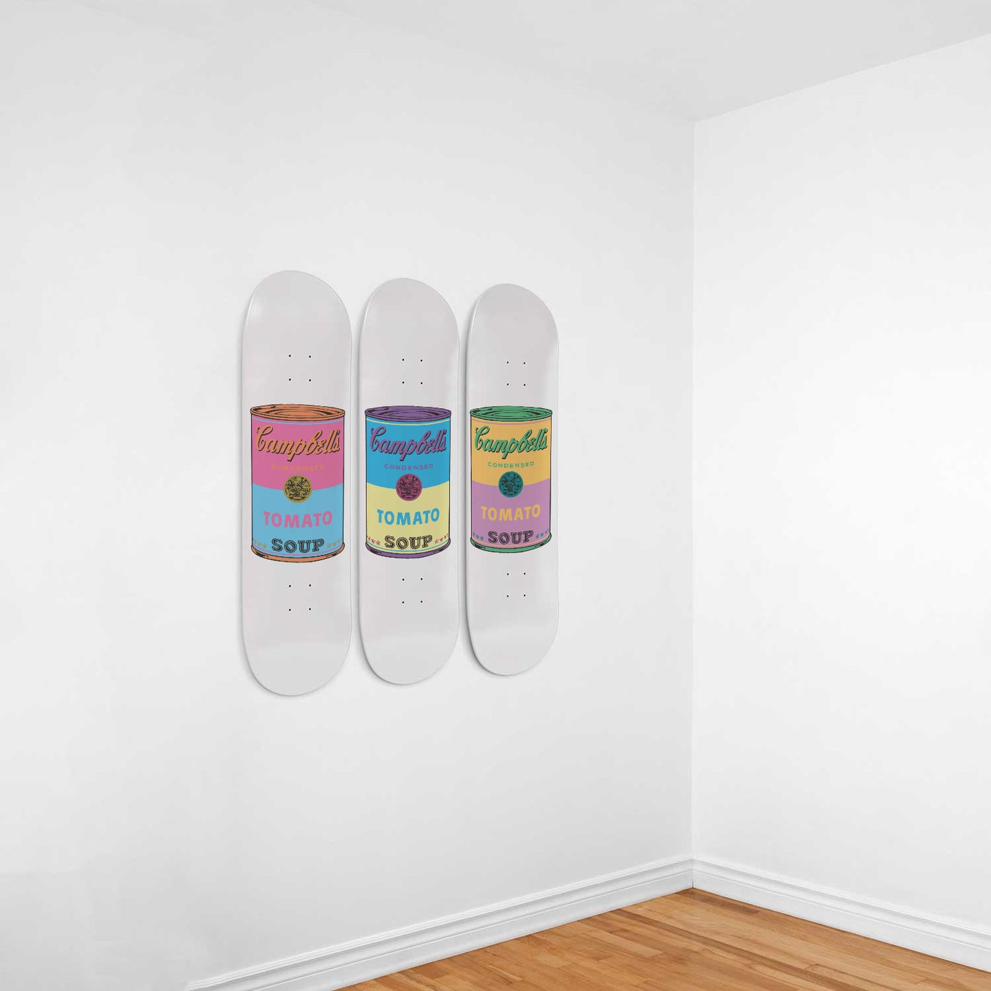
In a minimalist room, one exceptional skateboard becomes THE focal point. I use this in my current apartment with our Girl with a Pearl Earring duo on a large white wall. Nothing else competes for attention - the wall is completely empty except for those two coordinated pieces.
Key principles:
- Mount at exact eye level (57-60 inches from floor to center)
- Leave minimum 12 inches of empty space around all sides
- Ensure surrounding walls remain bare
- Use subtle lighting to enhance without overwhelming
- Choose muted classical pieces (avoid ultra-colorful works)
The beauty of minimalist display is that viewers actually look at the art. In maximalist spaces, eyes wander across everything. In minimalist spaces, there's nowhere else to go - your skateboard art receives full attention.
Color Coordination Matters More:
In minimalist spaces, every color is noticed. According to color theory research from The Art Newspaper, minimalist environments amplify color perception because there's less visual competition.
If your walls are white, choose skateboard art with subtle, harmonious tones. Soft blues, grays, earth tones - works like Vermeer or early Renaissance pieces. Avoid explosive Baroque drama unless that contrast is intentional.
Negative Space Is Your Design Tool:
Don't fill empty space just because it's there. I learned this from Japanese design principles during my work with Ukrainian brands - ma (negative space) creates breathing room that makes the positive space (your skateboard art) more powerful.
Your skateboard should occupy roughly 57% of the wall width it's on (golden ratio principle). The remaining 43% stays empty. This proportion feels naturally balanced without mathematical measurement.
Material Simplicity:
In minimalist spaces, the natural maple wood of the skateboard deck becomes a design element. It adds warmth to otherwise stark spaces. Don't add additional frames or elaborate mounting systems - let the skateboard's inherent form do the work.
From my background in graphic design and branding, I learned that minimalism isn't about removing everything - it's about keeping only what matters. Your skateboard art matters. Everything else? Questionable.
Displaying Skateboard Art in Maximalist Spaces
Maximalist display is where things get really fun - and where most people make mistakes. The goal isn't random chaos; it's intentional abundance. Your skateboard art needs to hold its own among competing visual elements.
The Gallery Wall Integration:
In maximalist spaces, skateboard art works beautifully as part of larger gallery walls. Our Bosch Garden of Earthly Delights triptych is perfect for this - the complex imagery matches maximalist energy while the triptych format creates structure.
Maximalist gallery wall principles:
- Mix skateboard art with framed prints, photographs, small objects
- Vary frame styles and colors (but keep some connecting thread)
- Overlap edges slightly - maximalism embraces density
- Include 3D elements (small shelves, sculptural pieces)
- Color repetition creates cohesion despite variety
The trick is that your skateboard art should be one of the largest pieces, serving as an anchor while smaller items orbit around it.
Embrace Bold Color and Pattern:
Unlike minimalist spaces where you choose muted tones, maximalist rooms thrive on visual richness. This is where dramatic classical works shine - Caravaggio's intense contrasts, Klimt's gold patterns, Bosch's surreal details.
Don't worry about color clashing. Maximalism celebrates color abundance. What matters is that colors repeat across the room - if your skateboard has golds and reds, echo those colors in pillows, books, other art pieces.
Layering and Depth:
Maximalist display uses three-dimensional layering. Your skateboard art might lean against the wall on a console, with smaller framed pieces in front, plants beside it, books stacked underneath. As I discussed in The History of Skateboard Art, skateboard art's physical depth (the curved deck) naturally creates shadows and dimension that enhance layered displays.
This layering tells stories. My personal maximalist corner has skateboard art, Ukrainian folk art prints, design books, a vintage camera, and plants - each element references different parts of my life, creating narrative through objects.
Collections Over Single Pieces:
Where minimalists display one perfect item, maximalists display collections. Instead of a single skateboard, consider duo or triptych sets. Multiple skateboards arranged asymmetrically, mixed with other art forms, create that curated abundance maximalism celebrates.
Pattern and Texture Integration:
Maximalist spaces typically feature multiple patterns - textiles, wallpaper, rugs. Your skateboard art adds another layer of pattern. The key is ensuring patterns vary in scale. If you have large floral wallpaper, choose skateboard art with finer details.
The natural wood grain of the skateboard deck adds texture that complements fabric-heavy maximalist rooms. That hard surface provides visual relief among soft materials.
The Hybrid Approach: Mixing Minimalist and Maximalist Elements
Here's what most design advice won't tell you - you don't have to choose one aesthetic exclusively. The most interesting interiors often blend elements from both, creating what I call "intentional eclecticism."
Minimalist Base with Maximalist Moments:
Keep most of your space clean and minimal, but create one maximalist focal wall or corner. Your skateboard art can be the centerpiece of that dense, layered moment while the rest of the room breathes.
I've seen this work beautifully where someone has stark white walls throughout, then one corner with skateboard art surrounded by books, plants, and smaller art pieces. The contrast makes both approaches stronger.
Maximalist Collection with Minimalist Display:
Alternatively, curate a large collection of skateboard art (maximalist impulse) but display only one or two pieces at a time (minimalist execution). Rotate seasonally. This gives you abundance without visual overwhelm.
I do this in my apartment - I own multiple pieces but display them one at a time, changing every few months. It keeps the space feeling fresh while satisfying my collector instincts.
Room-by-Room Variation:
Who says your entire home needs one aesthetic? Minimalist bedroom for calm sleep environment, maximalist living room for creative energy. Your skateboard art collection can serve both spaces with thoughtful selection.
From my experience organizing exhibitions, I learned that variation creates interest. Sameness across every room feels more like a showroom than a home... you know what I mean?
Practical Tips for Both Aesthetics
Let me give you some concrete, actionable advice that works regardless of which direction you lean.
For Minimalists:
- One exceptional piece beats three mediocre ones
- Invest in perfect lighting - it's half the display
- Choose skateboard art with compositions that work as standalone statements
- Consider the negative space around your art as part of the design
- Update seasonally by swapping (not adding) pieces
For Maximalists:
- Start with your largest skateboard piece, then build around it
- Repeat colors across different objects for cohesion
- Mix high and low - vintage finds alongside quality skateboard art
- Don't be afraid of asymmetry and unexpected juxtapositions
- Edit ruthlessly - maximalism isn't hoarding, it's curation
Universal Principles:
- Proper mounting hardware matters in both aesthetics
- Lighting transforms everything
- Your personal story should guide choices
- Quality materials show in any context
- Regular rotation keeps spaces feeling fresh
As I explored in Renaissance Art in Modern Culture, classical art's enduring appeal comes from its flexibility - it adapts to changing contexts while maintaining inherent value. Your skateboard art has that same adaptability.
About the Author
Stanislav Arnautov is the founder of DeckArts and a creative director originally from Ukraine, now based in Berlin. With extensive experience in branding, merchandise design, and vector graphics, Stanislav has worked with Ukrainian streetwear brands and organized art events for Red Bull Ukraine. His unique expertise combines classical art knowledge with modern design sensibilities, creating museum-quality skateboard art that bridges masterpieces with contemporary culture. Follow him on Instagram, visit his personal website stasarnautov.com, or check out DeckArts on Instagram and explore the curated collection at DeckArts.com.
Article Summary
This comprehensive guide explores how classical skateboard art functions in both minimalist and maximalist interior aesthetics. Drawing from years of design experience across European markets, I explain core principles of each approach, specific display techniques for minimalist negative space versus maximalist layering, hybrid strategies combining both aesthetics, and practical tips for showcasing skateboard art effectively regardless of your personal style preference.