

Yesterday morning, while reviewing installation photos from our latest Berlin client project, I noticed something fascinating: the most successful skateboard gallery walls all shared one common element—they told visual stories that unfolded naturally across the wall space. This wasn't accidental. After five years of creating these installations throughout Berlin's diverse architectural landscape, I've discovered that effective skateboard gallery walls function more like visual narratives than traditional art displays.
Unlike conventional artwork arrangements that rely on symmetry and predictable spacing, skateboard art demands a more intuitive approach. The boards themselves carry cultural weight and artistic significance that extends far beyond mere decoration. When properly arranged, they create dynamic conversations between pieces—conversations about skateboard history, artistic evolution, and personal taste that engage viewers on multiple levels simultaneously.
This realization came during my first major commercial installation in a Mitte co-working space. The client wanted "something edgy but professional" for their main conference room. Traditional corporate art felt sterile, but random skateboard placement looked chaotic. The solution emerged when I began treating each board as a character in a larger story, positioning them to create visual dialogue and cultural continuity.
Understanding Skateboard Art's Unique Display Requirements

Traditional gallery techniques assume flat, rectangular frames with standard proportions. Skateboard decks present entirely different challenges: consistent narrow profiles, sculptural concave shapes, and graphics designed for 360-degree viewing that must work effectively in fixed wall positions.
The most critical difference lies in dimensional depth. While paintings sit flat against walls, skateboard decks project forward 12-15mm due to their concave construction. This creates shadow patterns that change throughout the day, adding temporal elements to static displays. Understanding these shadows becomes crucial for optimal spacing and lighting decisions.
Cultural context adds another layer of complexity absent from traditional artwork. Each skateboard graphic represents specific moments in skateboard history, artistic collaborations, or subcultural movements. Successful arrangements honor these individual stories while creating unified aesthetic experiences accessible to viewers regardless of their skateboard knowledge.
Board orientation offers possibilities unavailable with traditional artwork. While most skateboard art displays use standard vertical hanging, horizontal orientations can create dramatically different visual effects, particularly in spaces with low ceilings or wide wall expanses.
The Foundation: Mastering Three-Board Compositions
Every sophisticated skateboard gallery wall begins with understanding fundamental three-board relationships. This configuration teaches essential principles about spacing, visual weight, and cultural harmony that scale effectively to larger arrangements.
Three-board horizontal arrangements create natural visual rhythms that the eye follows intuitively. The center position typically anchors the composition, with flanking boards providing balance and visual movement. This configuration works whether boards share artistic themes, color palettes, or historical periods.
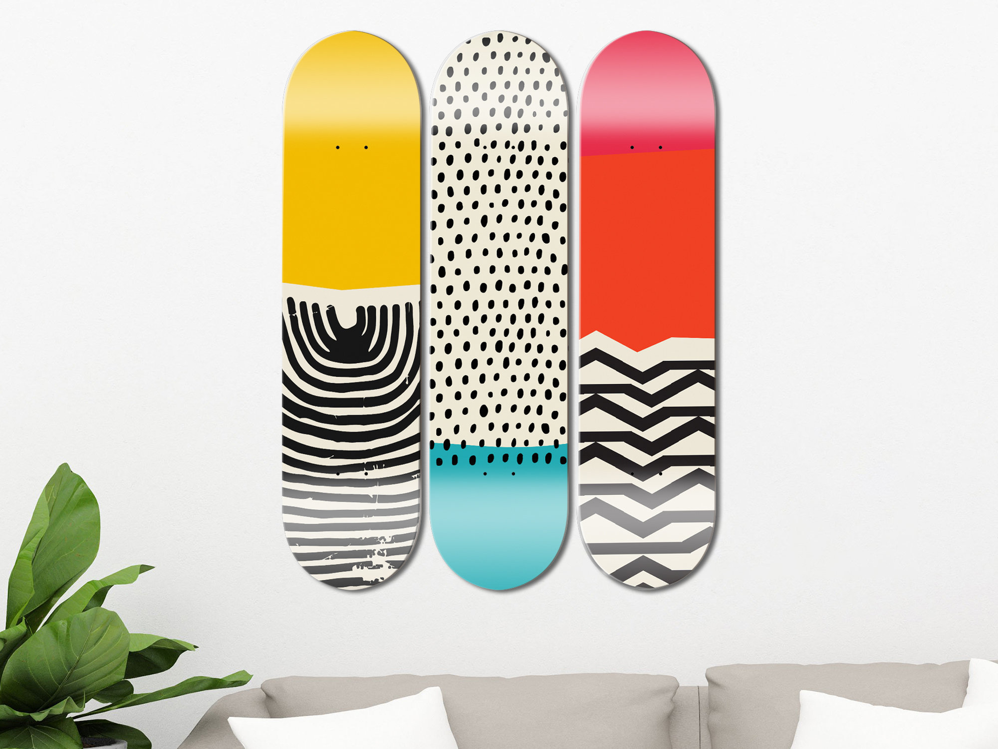
Optimal spacing for three-board arrangements depends on multiple factors: ceiling height, wall width, and viewing distance. In standard residential applications, 4-6 inches between boards creates intimate groupings that read as unified compositions. Wider spacing—up to 8 inches—works better in larger rooms or commercial applications where viewing occurs from greater distances.
Vertical three-board arrangements suit narrow walls or spaces adjacent to tall furniture. These columns create strong upward visual movement that can make rooms feel taller while providing dramatic focal points in otherwise understated spaces.
The triangular arrangement—two boards below, one centered above—offers dynamic asymmetry that feels more organic than grid-based layouts. This configuration requires careful attention to spacing relationships; the upper board should align with the center point between the lower boards, with vertical spacing slightly less than horizontal spacing to prevent visual disconnection.
Color Psychology in Skateboard Gallery Walls
Color relationships in skateboard gallery walls operate differently than traditional artwork due to the cultural significance embedded within graphics. Skateboard art colors often reference specific eras, companies, or artistic movements that carry meaning beyond pure aesthetics.
Warm colors—reds, oranges, yellows—advance visually and create natural focal points within arrangements. These boards draw immediate attention and work effectively as anchor pieces around which other elements orbit. However, too many warm-colored boards can create visual competition and restless viewing experiences.
Cool colors—blues, greens, purples—recede visually and provide restful spaces within busy arrangements. These pieces often work effectively as supporting elements that enhance rather than compete with warmer focal pieces.
The key lies in distributing colors thoughtfully throughout arrangements rather than clustering similar hues. If your collection includes multiple boards with significant red elements, space them across the composition to create visual rhythm rather than color-heavy zones that overwhelm other pieces.
Consider the cultural significance of color choices within skateboard graphics. Certain color combinations reference specific skateboard companies, artistic movements, or historical periods. Understanding these references helps create arrangements that honor cultural authenticity while achieving desired aesthetic effects.
Spatial Relationships: The Berlin Method
Living in Berlin has taught me to appreciate asymmetrical arrangements that feel sophisticated rather than rigid. The city's galleries rarely use perfect geometric layouts, instead favoring dynamic compositions that guide viewers through visual narratives organically.
This "Berlin Method" translates perfectly to skateboard gallery walls. Instead of centering everything or creating mathematical symmetry, consider how professional curators develop exhibition layouts: clustering related pieces, creating visual pathways between groupings, and using negative space as an active design element.
Start by identifying your strongest piece—usually the board with the most compelling graphics, richest colors, or deepest personal significance. This becomes your composition anchor around which other pieces find their natural positions based on visual weight, color relationships, and cultural connections.
Build arrangements by adding pieces that create visual dialogue with the anchor board. Look for complementary colors, similar artistic styles, or cultural relationships that enhance rather than compete with the central piece. Avoid placing boards in rigid rows or columns; instead, let each piece find its position based on visual weight and narrative flow.
The key to successful asymmetrical arrangements lies in achieving overall balance through dynamic rather than static means. If you position two boards left of your anchor piece, balance them with different-sized groupings on the right side that carry equivalent visual weight without mirror-image repetition.
Advanced Spacing Techniques
After creating hundreds of skateboard installations throughout Berlin's diverse architectural contexts, I've developed specific spacing guidelines that account for the unique characteristics of skateboard art displays.
The "4-6-8 Rule" provides baseline measurements for different applications:
- 4 inches: Intimate arrangements in small spaces or tight groupings
- 6 inches: Standard residential spacing for most applications
- 8 inches: Maximum spacing for maintaining compositional unity
These measurements refer to closest approach distances between boards, accounting for sculptural projection rather than simple edge-to-edge measurement. Unlike flat artwork where frame edges provide clear reference points, skateboard spacing must consider dimensional depth and shadow patterns.
Ceiling height significantly influences optimal spacing choices. Rooms with 8-foot ceilings benefit from tighter spacing that emphasizes horizontal flow and prevents arrangements from overwhelming limited vertical space. Higher ceilings accommodate more generous spacing that creates dramatic vertical impact.
Wall width affects spacing decisions equally. Narrow walls require tighter groupings to prevent boards from extending too close to corners or adjacent architectural elements. Wider walls can accommodate more generous spacing that allows each piece adequate visual breathing room.
Height Placement and Viewing Optimization
Standard gallery practice positions artwork center points at 57-60 inches from floor level, aligning with average adult eye height. Skateboard gallery walls benefit from modifications to this rule due to their unique proportions and cultural viewing contexts.
For horizontal arrangements, establishing a central "horizon line" at standard eye level works effectively, with individual boards positioned relative to this reference point according to compositional needs rather than rigid adherence to identical heights.
Furniture relationships significantly affect optimal hanging heights. Arrangements above sofas require 6-8 inches clearance between highest upholstery points and lowest board edges to prevent visual crowding while maintaining proper proportional relationships.
Dining room installations over sideboards or credenzas can be positioned slightly higher since viewing typically occurs from seated positions. Bedroom arrangements above beds can be positioned lower since viewing often occurs from reclining positions.
Consider traffic patterns and viewing angles when determining heights. Hallway installations might benefit from slightly lower positioning to accommodate viewing while walking, while living room arrangements should optimize for both seated and standing viewing positions.
Lighting Strategies for Dimensional Art
The three-dimensional nature of skateboard art creates unique lighting opportunities that flat artwork cannot achieve. Proper illumination enhances sculptural qualities while ensuring graphic readability and color accuracy.
Track lighting positioned at 30-degree angles provides ideal illumination that highlights board concavity while minimizing harsh shadows on graphics. LED spotlights offer precise directional control and color temperature adjustment for optimal visual presentation.
As I learned through expensive experimentation detailed in my lighting guide, avoid positioning lights perpendicular to boards, which creates flat illumination that negates sculptural benefits.
Natural light considerations become crucial for long-term preservation. While morning or late afternoon light can create beautiful effects on skateboard graphics, direct midday sunlight may cause gradual fading. Position arrangements to benefit from natural light while avoiding prolonged UV exposure.
Evening lighting maintains visual impact after dark. Warm LED lighting (2700-3000K) enhances wood tones and creates inviting atmospheres, while cooler lighting (4000-5000K) provides better color accuracy for detailed graphic appreciation.
Integrating with Existing Interior Elements
Successful skateboard gallery walls must integrate harmoniously with existing furniture, architectural features, and decorative elements rather than existing as isolated artistic statements.
Furniture placement affects gallery wall success significantly. Consider how seating arrangements, table heights, and storage pieces relate to planned wall arrangements. Sometimes repositioning furniture improves gallery wall effectiveness more than modifying artwork configuration.
Architectural elements provide opportunities for enhanced integration. Exposed brick walls, industrial fixtures, and modern minimalist environments all complement skateboard art naturally, but require different arrangement approaches to maximize visual harmony.
Traditional artwork can coexist successfully with skateboard displays when handled thoughtfully. The key lies in maintaining sufficient visual separation to prevent stylistic competition while allowing each art form to contribute to overall spatial character.
Color coordination with existing decor requires balancing skateboard graphic colors with room palettes without sacrificing cultural authenticity of individual pieces. Sometimes adjusting accent colors through accessories, textiles, or lighting proves more effective than compromising artwork selection.
Collection Development and Rotation Strategies
Building impressive skateboard gallery walls requires strategic collection development rather than random acquisition. Focus on quality over quantity, selecting pieces that offer both individual appeal and compositional potential within larger arrangements.
Consider thematic coherence when building collections. Groups of boards sharing artistic styles, historical periods, or cultural movements create stronger compositional possibilities than completely disparate pieces. However, avoid overly literal matching—the goal is harmonious conversation rather than monotonous repetition.
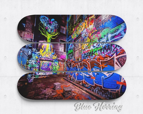
The authentic pieces in our collection are specifically chosen for their gallery wall potential, combining cultural significance with visual appeal suitable for sophisticated interior design applications.
Rotation keeps arrangements fresh while protecting pieces from prolonged UV exposure. Seasonal changes, personal mood shifts, or evolving interior design can all justify arrangement updates that maintain interest and engagement with your collection.
Storage considerations become important for rotating collections. Proper storage protects unused pieces while maintaining their condition for future display opportunities. Climate-controlled environments prevent warping, fading, or graphic deterioration.
Common Installation Mistakes and Solutions
The most frequent error involves treating skateboard gallery walls like traditional picture arrangements. Clients often hang boards too close together, creating visual competition, or too far apart, losing compositional unity.
Height inconsistencies plague many amateur installations. Unlike framed artwork where frames provide visual anchors, skateboard graphics require more precise positioning to create intentional rather than accidental compositions.
Ignoring cultural context results in arrangements that may be visually appealing but culturally incoherent. Mixing graphics from completely different eras, styles, or movements without understanding their relationships often creates confusion rather than visual interest.
Insufficient planning leads to multiple nail holes and frustrated attempts at achieving satisfactory results. Always use paper templates cut to skateboard proportions and experiment with arrangements before installing permanent hanging hardware.
Room proportion miscalculations result in arrangements that overwhelm small spaces or disappear in large rooms. Consider ceiling height, wall width, and furniture scale when planning gallery wall size and configuration.
Budget-Conscious Approaches
Creating impressive skateboard gallery walls doesn't require enormous budgets, but it does demand strategic planning and patience. Start with carefully selected authentic pieces that offer genuine cultural value rather than mass-market reproductions.
Build collections gradually, focusing on pieces that work individually while contributing to larger compositional goals. Three carefully chosen, high-quality boards create stronger visual impact than seven mediocre pieces while allowing budget distribution over time.
Consider mixed arrangements combining purchased pieces with personal boards carrying cultural or emotional significance. These combinations often create the most meaningful and visually compelling gallery walls.
DIY mounting solutions can reduce installation costs significantly without compromising safety or presentation quality. However, invest in appropriate hanging hardware that accommodates skateboard weight and dimensions properly.
Maintenance and Evolution
Successful gallery walls evolve over time, requiring periodic assessment and adjustment. Dust accumulation, shifting personal tastes, and collection growth all influence long-term development.
Monthly cleaning maintains visual impact and protects investment value. Use soft brushes or microfiber cloths to remove dust from board surfaces and mounting hardware without damaging graphics.
Annual arrangement reviews provide opportunities to refresh compositions, incorporate new pieces, or respond to changing room functions. These reviews keep gallery walls feeling current and personally relevant rather than static decorative elements.
For comprehensive preservation techniques, refer to my detailed care guide, which covers everything from cleaning methods to long-term conservation strategies for maintaining collection value.
Creating effective skateboard gallery walls requires understanding the unique characteristics of these cultural artifacts while applying proven design principles adapted for their specific requirements. The techniques developed through years of Berlin installations ensure maximum visual impact while honoring the cultural significance of each piece.
Whether starting with simple three-board arrangements or planning extensive collection displays, remember that the most successful gallery walls tell stories—about the art, the culture, and the people who choose to live with these powerful visual statements.
The skateboard art we offer is specifically chosen for gallery wall applications, combining authentic cultural significance with sophisticated visual appeal that enhances contemporary interior design approaches.
Stanislav Arnautov is the founder of DeckArts, a Berlin-based company specializing in authentic skateboard wall art. With over five years of experience in Berlin's dynamic creative scene and deep roots in skateboard culture, Stanislav bridges the gap between street culture and contemporary interior design. Follow his insights on Instagram @rntv and visit his personal website at stasarnautov.com